Object Rotterdam 2018 – the morning after
Do you know what I like best about design exhibitions like Object Rotterdam? The morning after! I go through all the photos I’ve taken and as I drink at least five cups of coffee, I read all the websites of the designers whose work I’ve seen. For me, it’s the only…

Do you know what I like best about design exhibitions like Object Rotterdam? The morning after! I go through all the photos I’ve taken and as I drink at least five cups of coffee, I read all the websites of the designers whose work I’ve seen. For me, it’s the only way to truly take in everything I’ve seen. So many wonderful things to see and get greedy about! I also loved taking my mother to Object Rotterdam for the first time – such a nice way to catch up with everything that’s been going on in her life.
KUDOS to curator Anne van der Zwaag, of course – Object Rotterdam is bigger and better than ever. If you want to see the best that Dutch Design has on offer in 2018, go there NOW. PS: The new location at the HAKA building is fan-tas-tic.
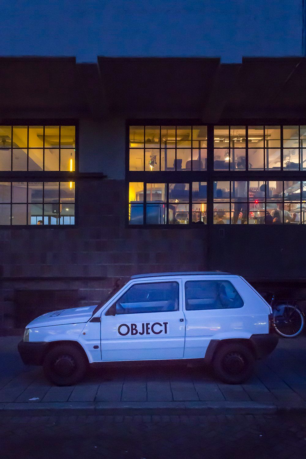
I know for a *fact* that Object Rotterdam curator Anne van der Zwaag drives this Fiat Panda. Sadly, it was also a grim reminder of the Panda points I’ve racked up this past year and a half.
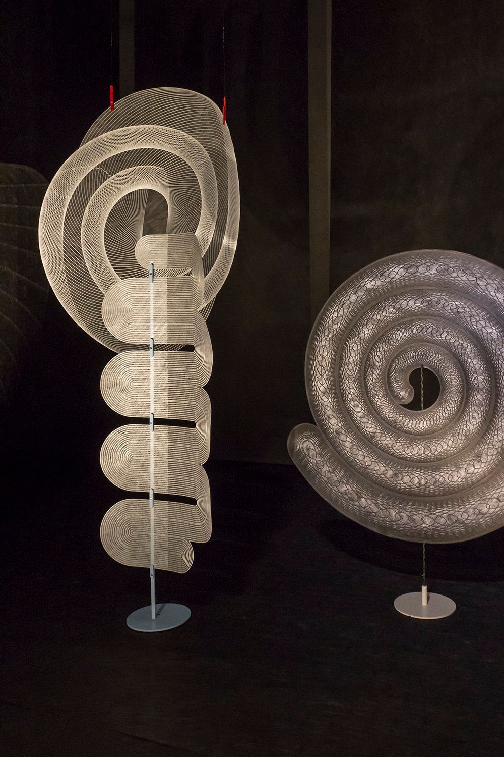
They grow up so fast! It only seems like yesterday when I first met Rick Tegelaar during Elle Inside Design – when in fact, it was 2013. Ouch! I must have missed him at Object Rotterdam, but his work definitely was present. Okay, so what are we looking at? I sat down this morning to do a little post-exhibition research and found out that Rick has designed a series of panels using Colback yarn from materials manufacturer Low & Bonar. His work is part of a group project called In4nite (very Prince-esque, don’t you think) and you can read all about it right here.
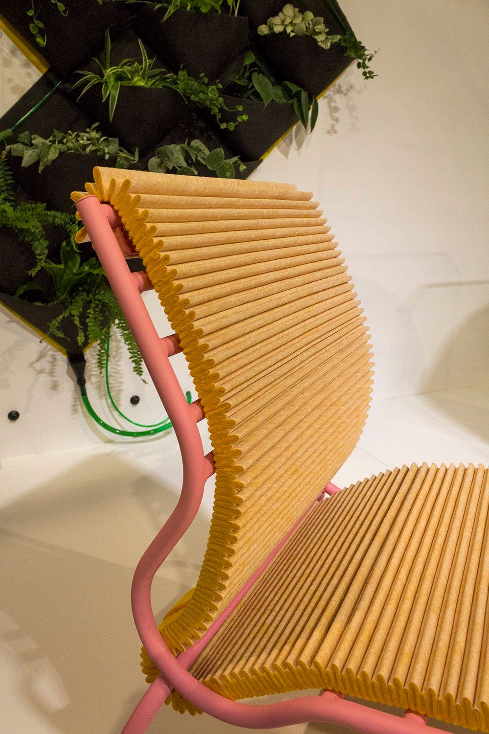
Wouldn’t you know it! Another In4nite project – this time around from Joris de Groot. His Pleated Seat was definitely my mother’s favorite item on display at Art Rotterdam. Bonus points for the great color combination by the way – I loved the soft pink and orange.
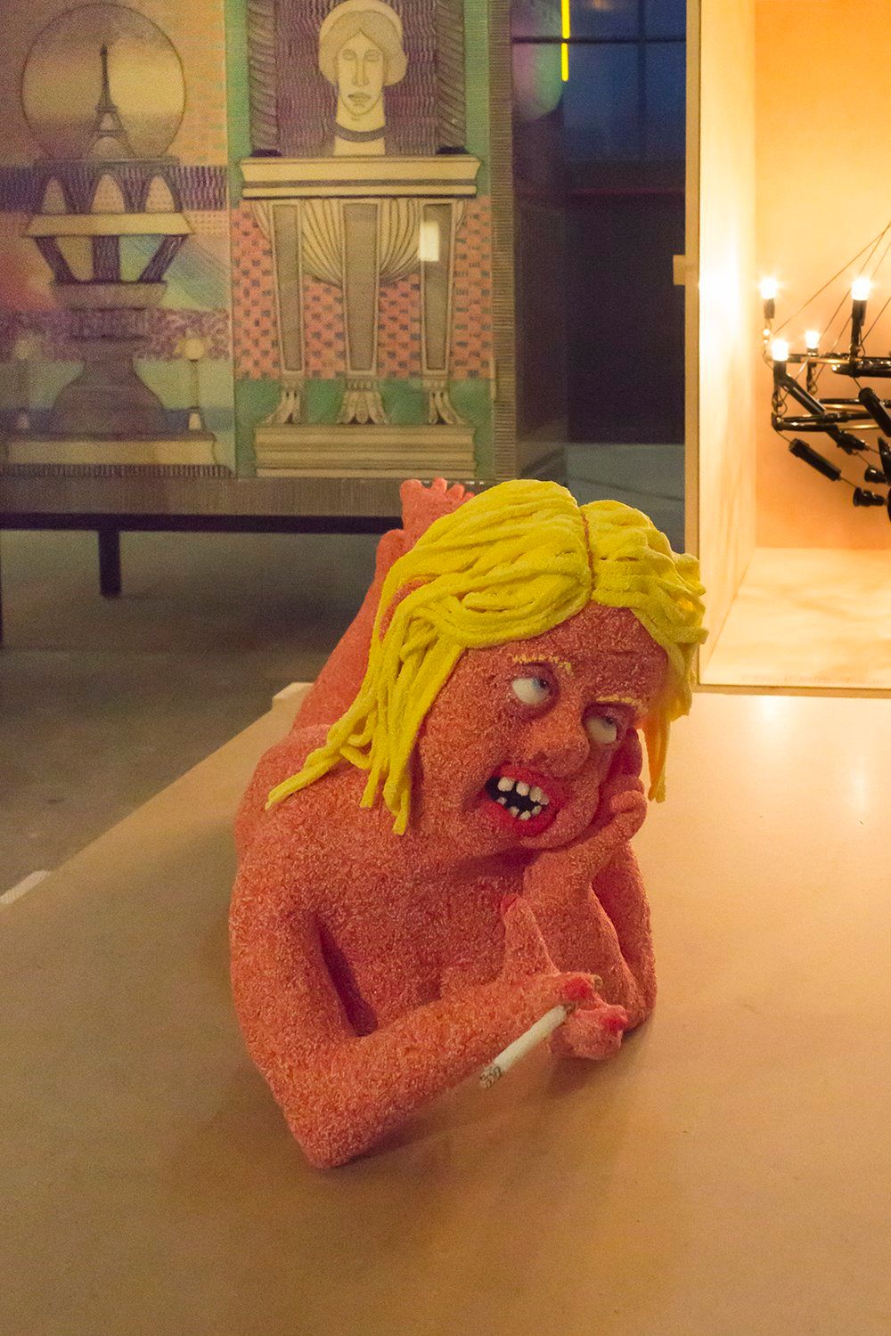
By the time my mother and I got to Nightshop, things got busy. I ran into tons of people and got so distracted by WOTH editor Mary Hessing and her new round glasses, I only took one halfway decent photo of one of Nightshop’s PERSONS. What I really wanted to see up close and personal was this BUSINESS FURNITURE cabinet. But, alas, I had to move on.
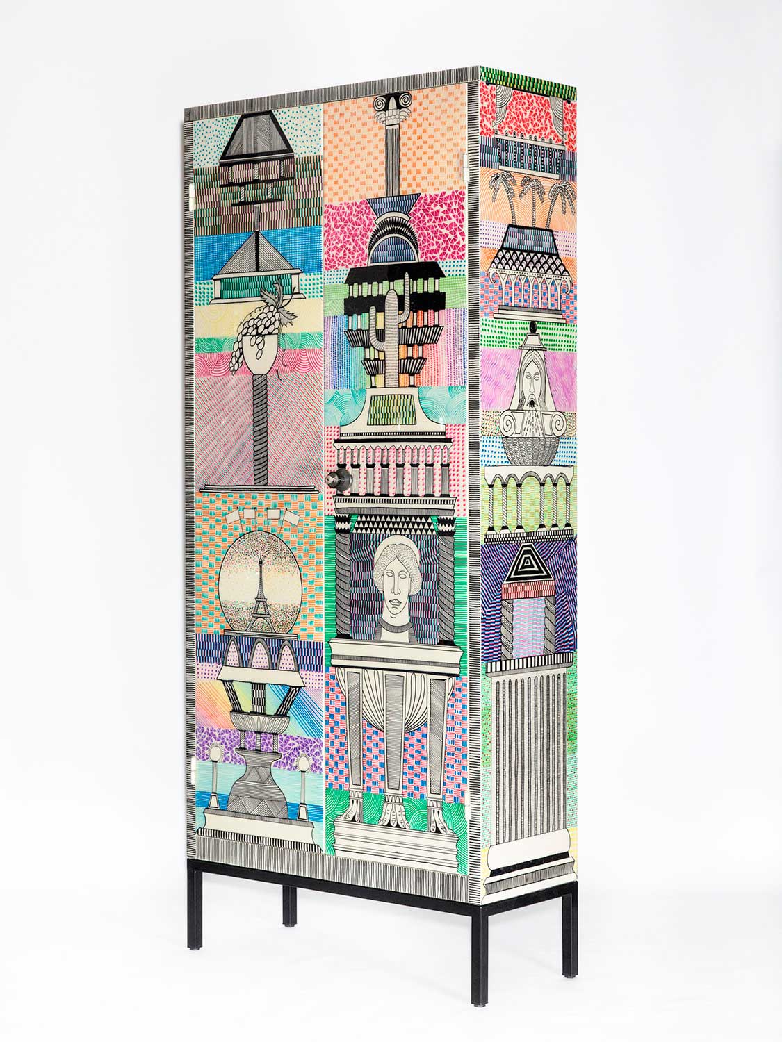
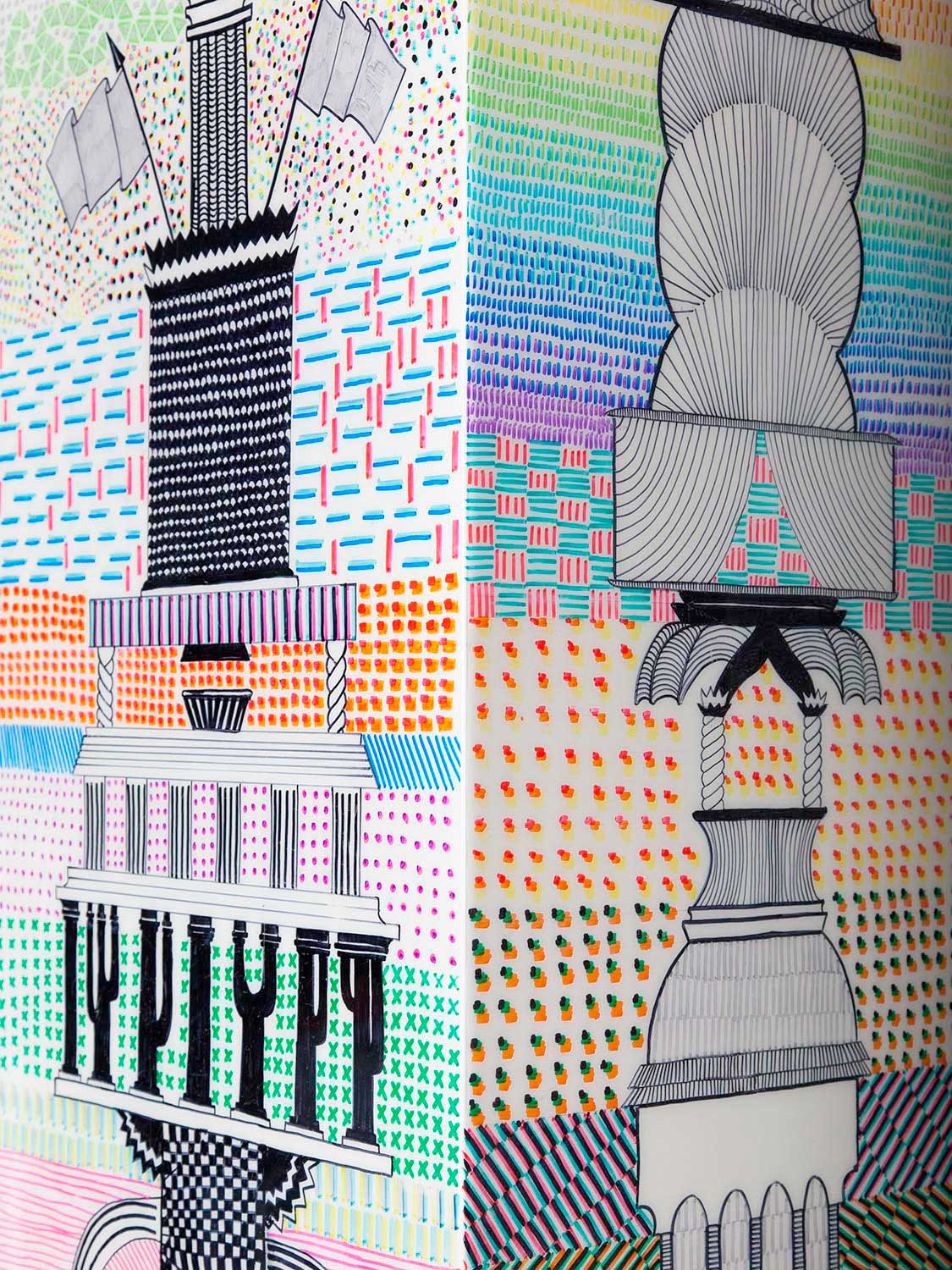
See what I mean? I got these photos from the Nightshop website and in my mind, I’m already rearranging my living room so that this thing of beauty will fit. But no matter whether I find just the right spot or not, it’s doesn’t matter in the end. I’ve put myself on a financial diet after I bought this green crystal vase by Isaac Monté. You can only spend it once, right? ¯\_(ツ)_/¯
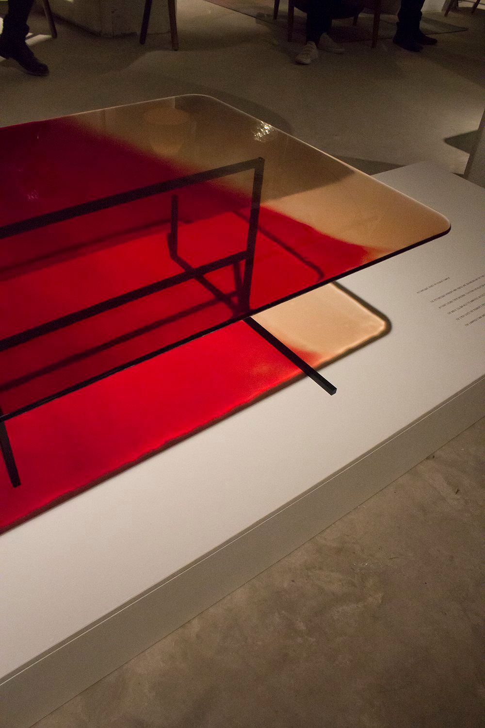
The last time gradients were a thing was in 2011 – and it’s already making a comeback! Case in point: this Picturesque table by Studio Tjimkje. Here’s a photo I copied from their website. Saweet!

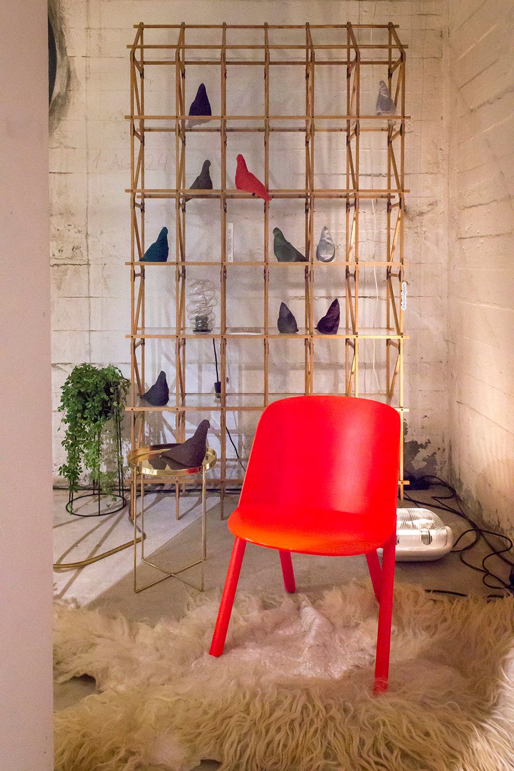
Nice rack! The way it’s styled right here by Just Haasnoot is a bit too Scandinavian for my taste, but believe me – with the right objects, Mieke Meijer’s Frameworks FW45 looks fantabulous (and I should know, because there’s a photo of it in my upcoming book. So there)
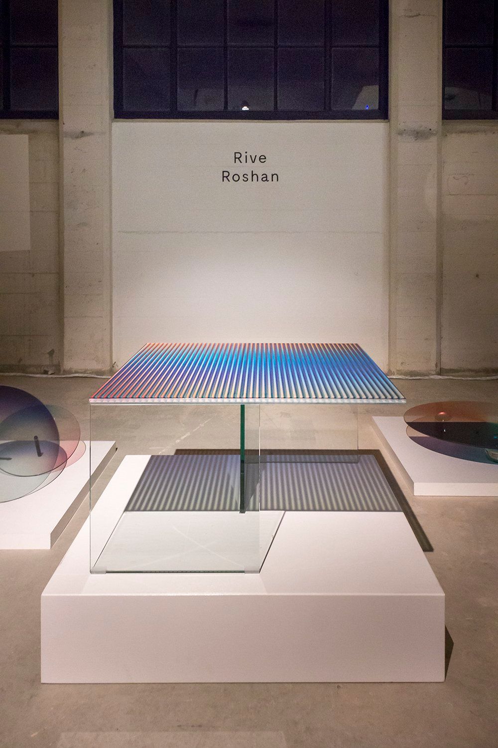
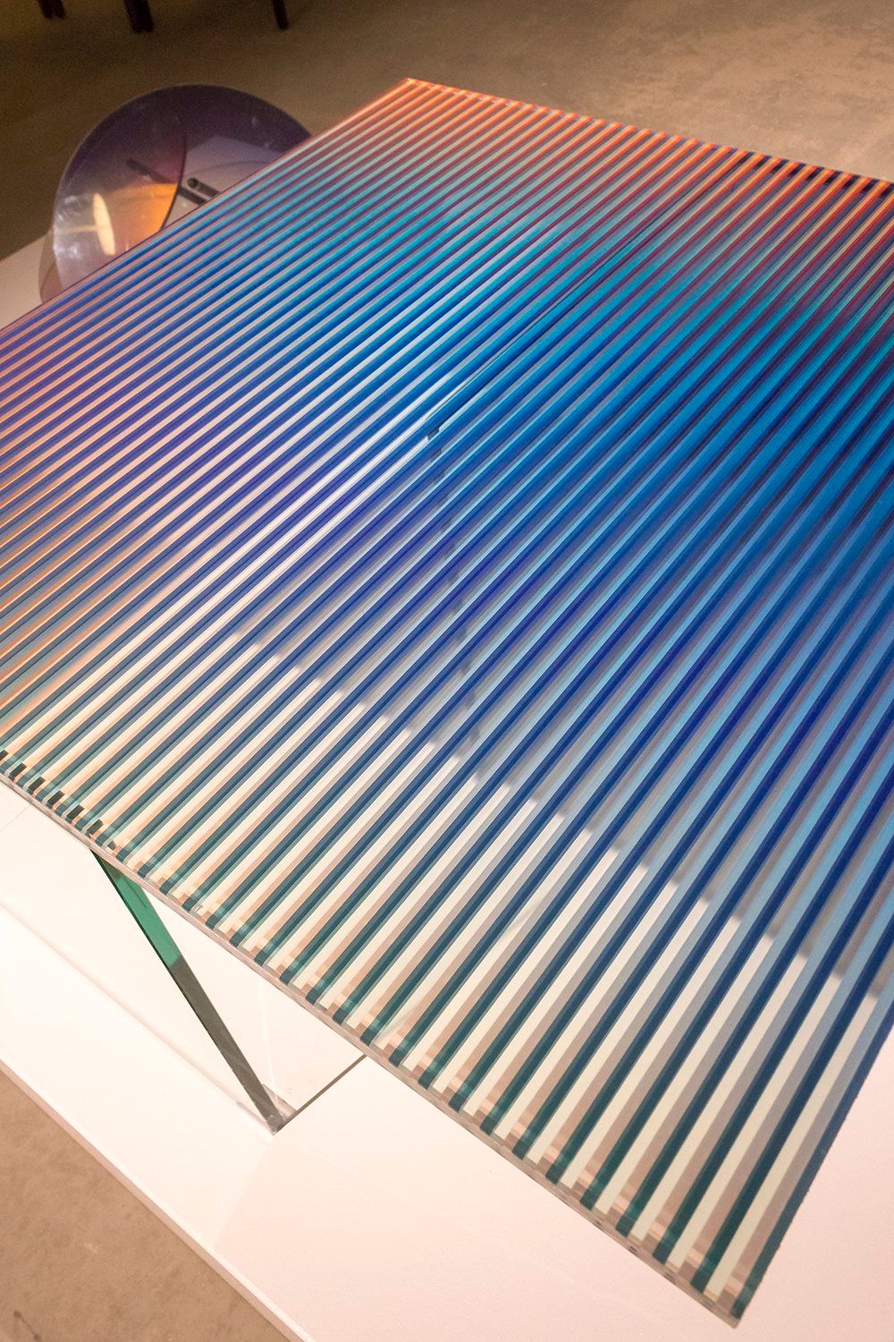
Then…a designer I hadn’t heard of before. You can’t know everything, right? Oh whoops, turns out Rive Roshan is actually two designers called Ruben de la Rive Box and Golnar Roshan.
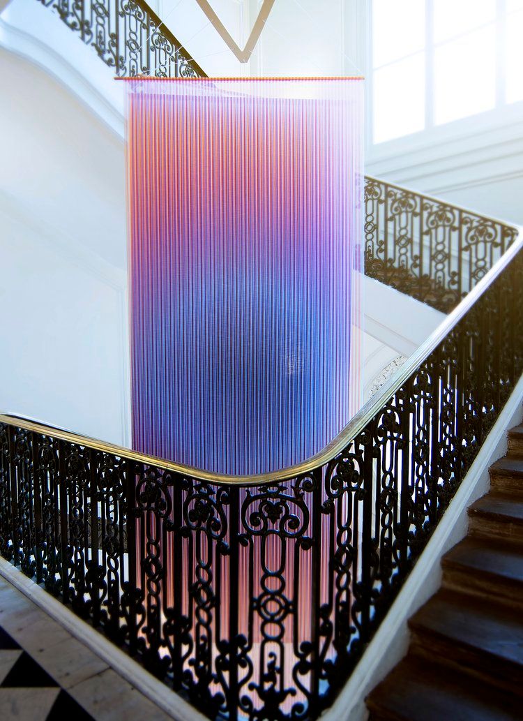
Check out their excellent website (that’s where I found the photo you see here) but before you do, make sure you have a washcloth at the ready because I guarentee you, there will be drool.
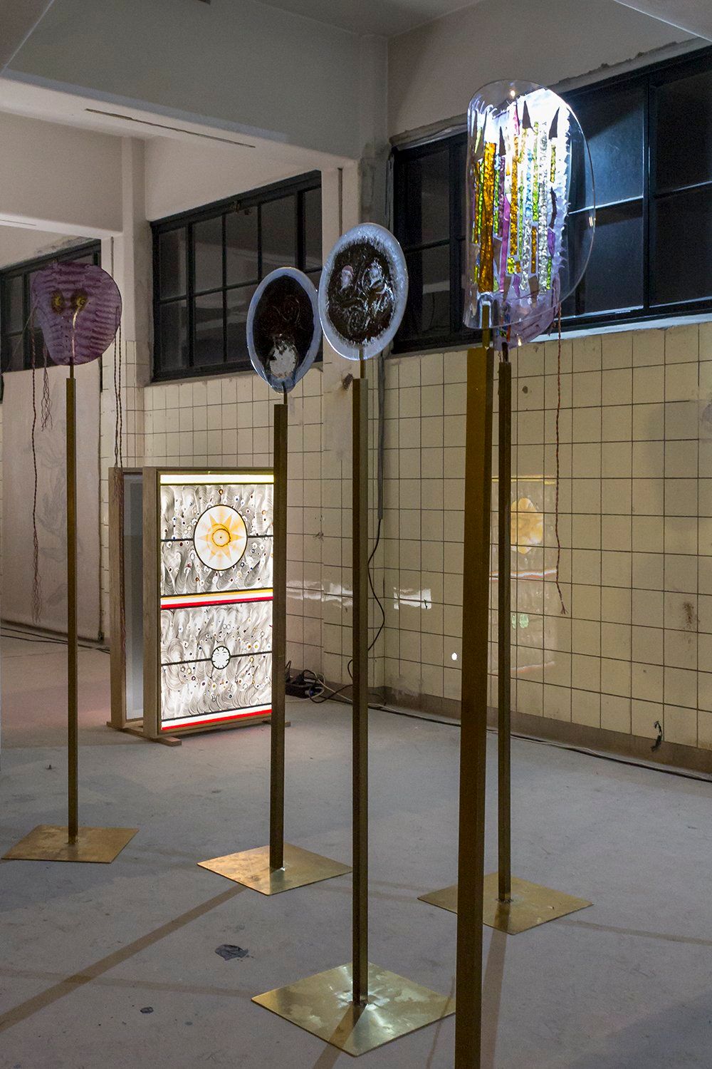
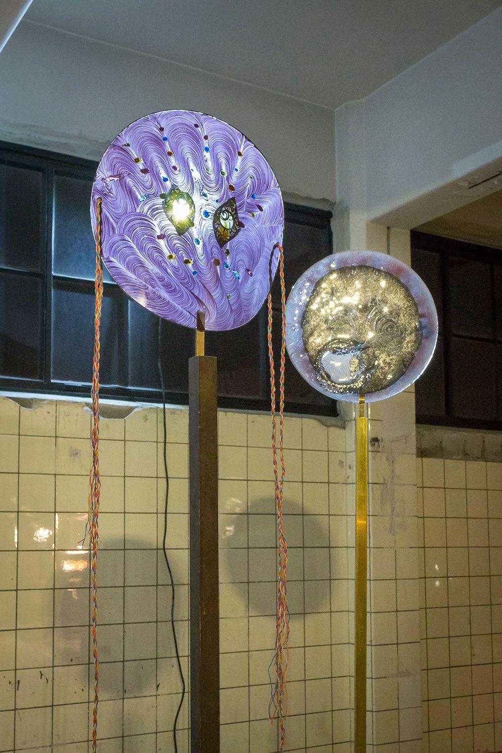

I’m a bit a bit wary when it comes to glass ever since I stumbled over my glass coffee table on New Year’s Eve but I have to say these glass masks and crucifixes by Marc Mulders and Jan Koen Lomans look absolutely smashing.

Location, location, location! These bok. garden hose lamps by Sander Bokkinga normally wouldn’t necessarily be my thing but you have to admit they look perfect in front of the giant windows of the HAKA building.
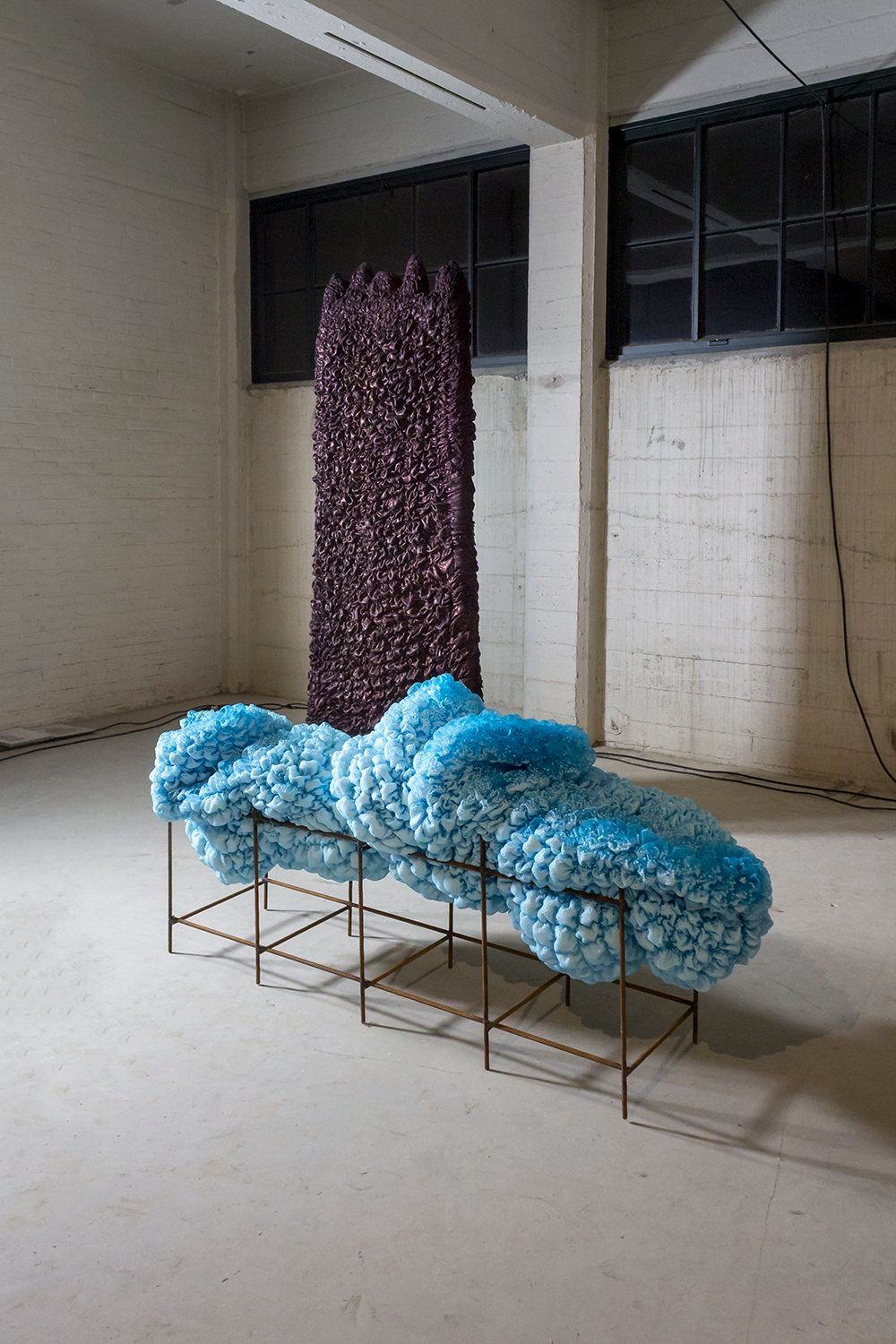
Yes, but what is it? I know what you’re thinking and I had the same question when I saw Landscape in 2 Parts by Femmie Duiven. I read this fascinating artist’s About page and realized that I still have a lot to learn about sculpture. For now, all I can say that Femmie’s work is definitely pleasing for the eye.

I interviewed Remco and Remty from Rem Atelier a few years ago – such a nice couple! This collection of Growing Plants Indoors is still a personal favorite.
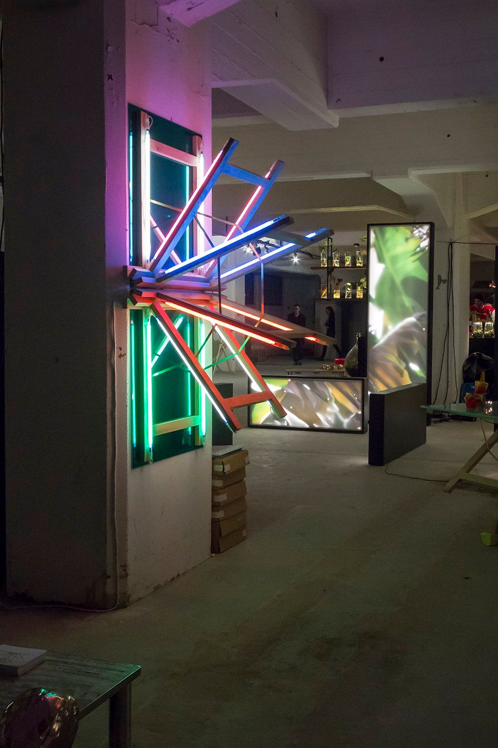
And….that was it! I took one last photo of the Trestle Dazzle by Rem Atelier and I was out. What a show!
