Moooi! An exclusive interview with stylist Martine de Schipper
It is the biggest interior design in the world – Milan Design Week. Needless to say, I was there. I ran as fast as my legs could carry me to the Via Savona showroom of Moooi, where I met up for an exclusive interview with stylist Martine de Schipper of Stories of Sense…

It is the biggest interior design in the world – Milan Design Week. Needless to say, I was there. I ran as fast as my legs could carry me to the Via Savona showroom of Moooi, where I met up for an exclusive interview with stylist Martine de Schipper of Stories of Sense and Space. For the 2017 show A Life Extraordinary this top-notch interior stylist rented art works from Kunstuitleen Rotterdam – some of which were at my home up until a few weeks ago. Fancy that!
Lees je dit interview liever in het Nederlands? Kijk dan op de website van Kunstuitleen Rotterdam!

Milan Design Week 2017 – Day 1: An interview at Moooi
Martine, before we take a walk around the insanely beautiful showroom of Moooi, could you please tell me a bit about what you do?
“What I do with my studio, is visualing worlds. I create atmospheres, either for brands such as Moooi but also at special events. I determine the look and feel, and that can even include catering, the staff uniforms and the music you hear. A total experience, that’s what it’s about in my line of business.”
The showroom of Moooi is a place of pilgrimage for design lovers from around the world. What is the theme for this year’s Milan Design Week?
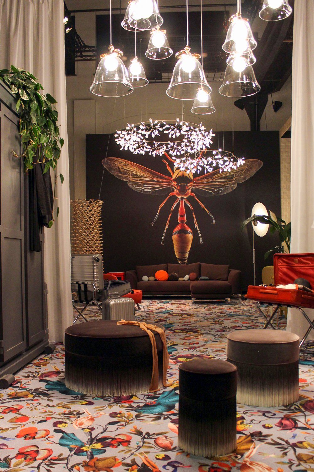
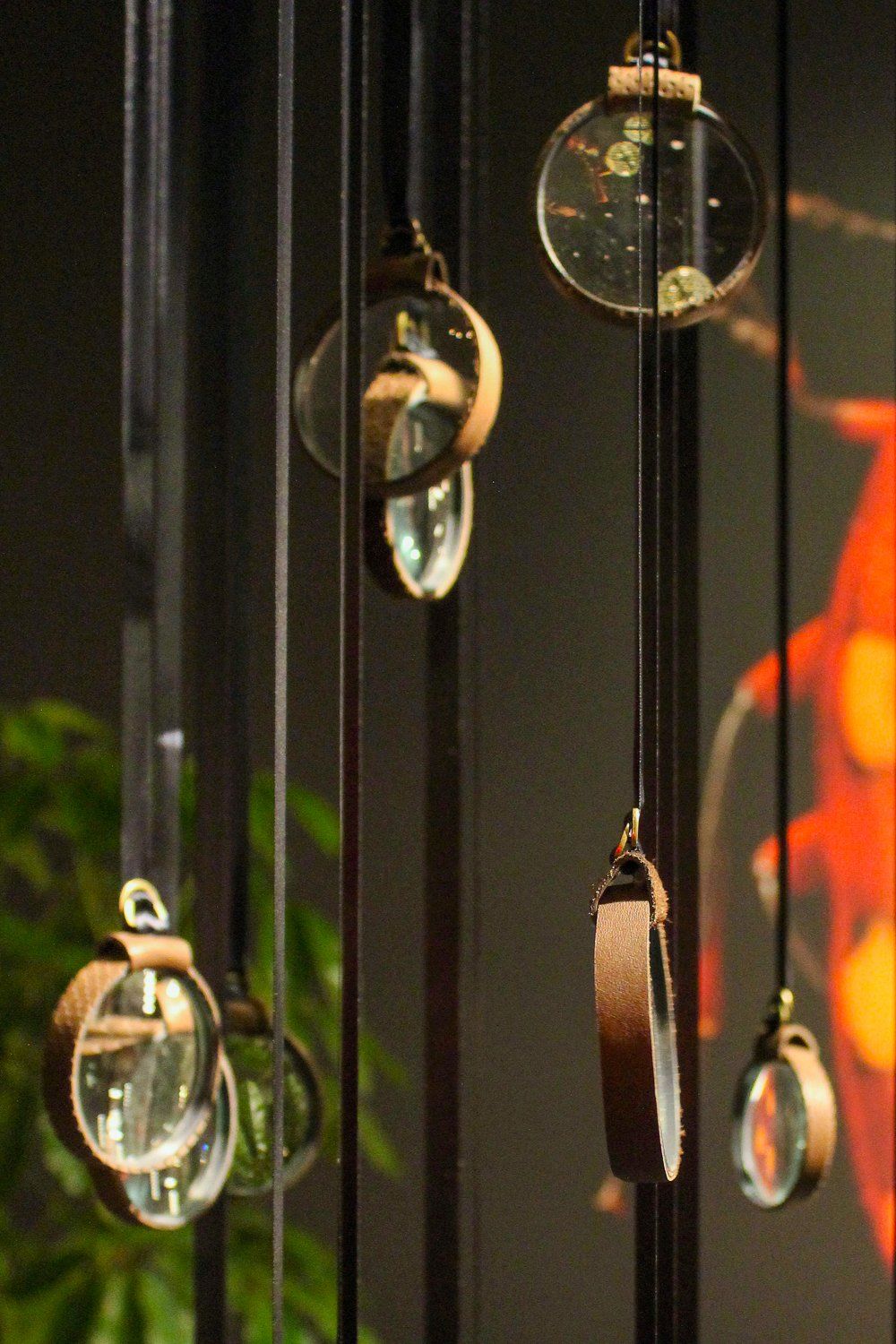
“Marcel Wanders, the co-founder of Moooi, recently got inspired by photographer Levon Biss, who takes these incredible close-up pictures of insects. You can see every single detail, even the tiniest hairs on each leg. That theme made me say ‘yes’ to Moooi for yet another year. I’m fascinated by the environment that we’re all part of without fully realizing it. It’s the invisible world of nature around us. We all know insects exist but we actually know very little about their world. This year’s theme at Moooi is Come Closer – a theme that fits perfectly with my idea to bring people closer to the tactility of insects. It also led me to the idea of designing an installation made up of magifying glasses.”

The art works from Kunstuitleen Rotterdam are a prominent feature this year around. How did you find them?
“I’ve worked a lot a production designer for feature films. One of my co-workers, who is from Rotterdam, recently showed me the amazing pieces he rented from ‘his’ art library. I wanted that as well, even though I live in Amsterdam myself. I rented some pieces for a photo assignment and found out that the people who work at Kunstuitleen Rotterdam are super nice as well. Mind you, we have our own art library in Amsterdam, but the one in Rotterdam has a collection that I find really appealing.”
Do you want to walk around the showroom and tell me a bit about the works you’ve selected?
“Sure! Let’s start with this neon object by A. Burgering. Based on the picture in the online catalogue, I thought the neon spiral would be hot pink. In reality, it’s a beautiful shade of red. It works really well with the warm hues here in the Moooi showroom.”

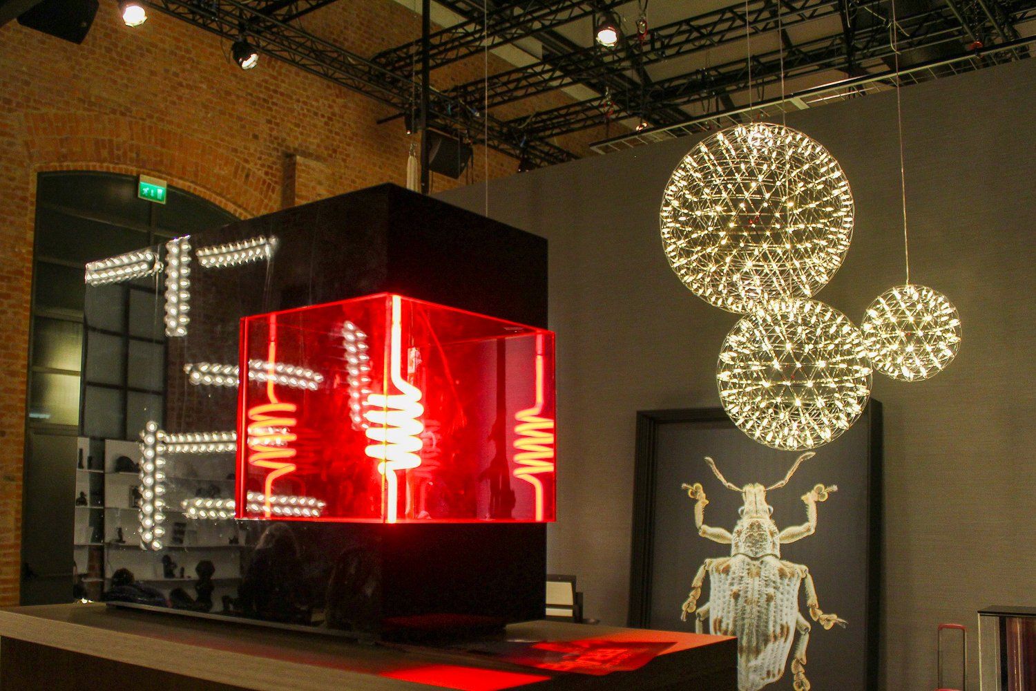
Neon object by A. Burgering at the Moooi showroom
Okay, so the color combination is something you consider. How about that pink plexiglas pillar? It was a prominent part of my living room for the last for years, so it’s very odd to see it here in this setting.
“What I look for is contrasting shapes. There are a lot of round and natural forms in this space. First, of course, there’s a giant photo of an insect. And then there’s also the carpeting with an opulent floral print and the pink ribbons that are draped on the bed. The contrast with the straight lines of the pillar combined with the sparkle of its pink core looks stunning to me.”
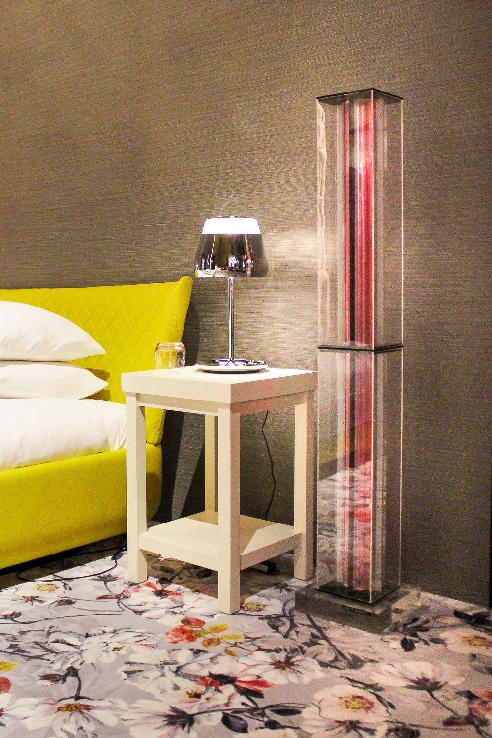

Plexiglass pillar by L. Rijnboutt at Moooi in Milan
Here in the back of the Moooi showroom the combination of this huge wooden object with the insects looks pretty clear.
“Yes, it’s a nice rhyme of images. The reddish brown lacquered wood also works great with the photo of the insect in the background.”
I’ve seen this piece before and I have to say that this is the first time that I see it in a location that makes me think: This works!
“The size of a piece really matters. In a giant space like this one a smaller object would disappear visually.”
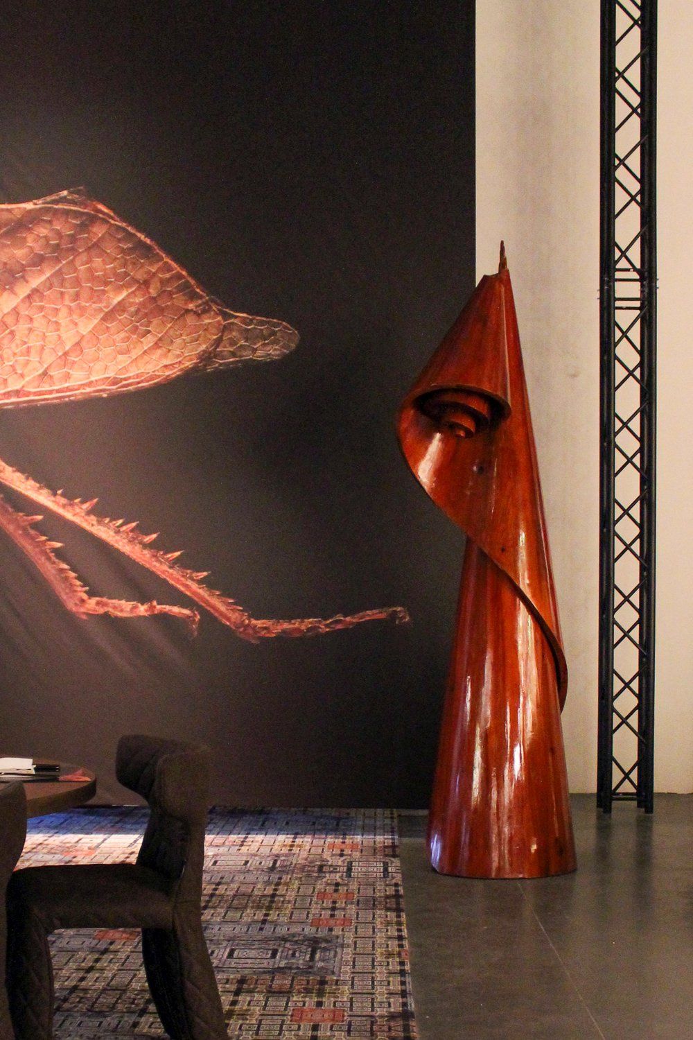

Wooden object by R.J. Maingay
And yet I’ve also noticed some smaller objects, like the brass shoes by my former classmate Petra Laaper.
“The shoes are on a nightstand and that is the perfect spot. This bedroom visualizes a small apartment. The idea was to use some smaller items to make them look like a collection. I think the glimmer in the brass shoes is fantastic. They have this rare combination of humor and elegance. The soft lighting also makes them look great.”
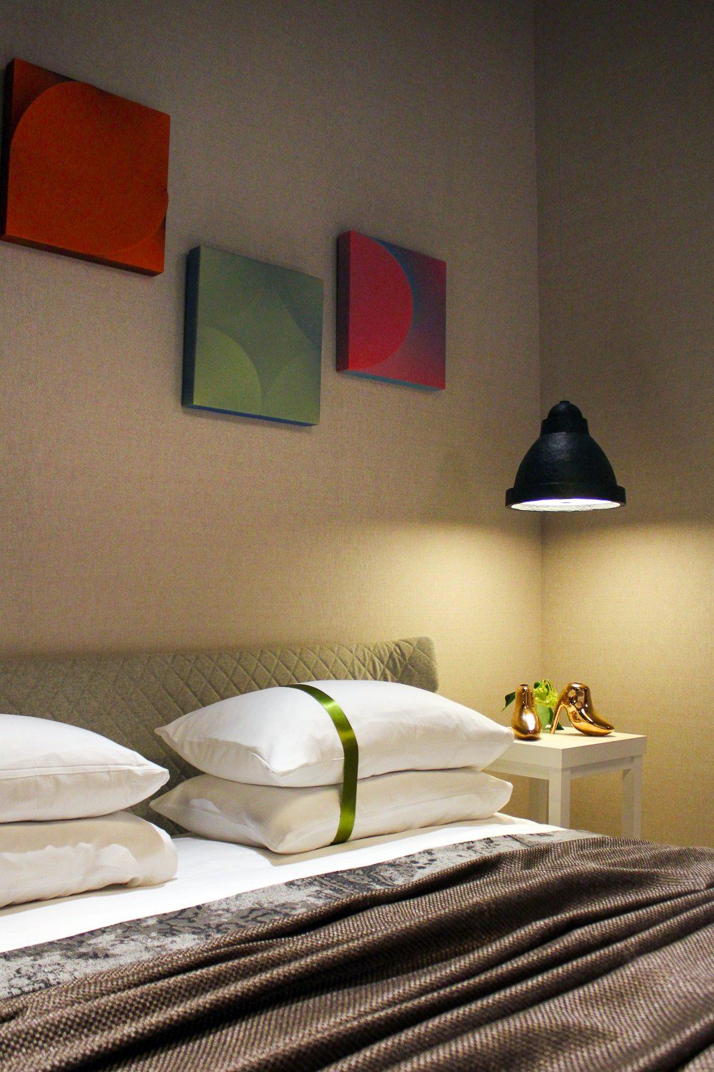

Brass shoes by Petra Laaper
So lighting also play a big role? I’m having a lightbulb moment!
“To me, good lighting is essential. In this small corridor the lighting is not perfect. Especially in a darker space, you need good lighting to give a work of art some sparkle. It worked really well with Petra Laaper’s shoes. But here, not so much unfortunately.”
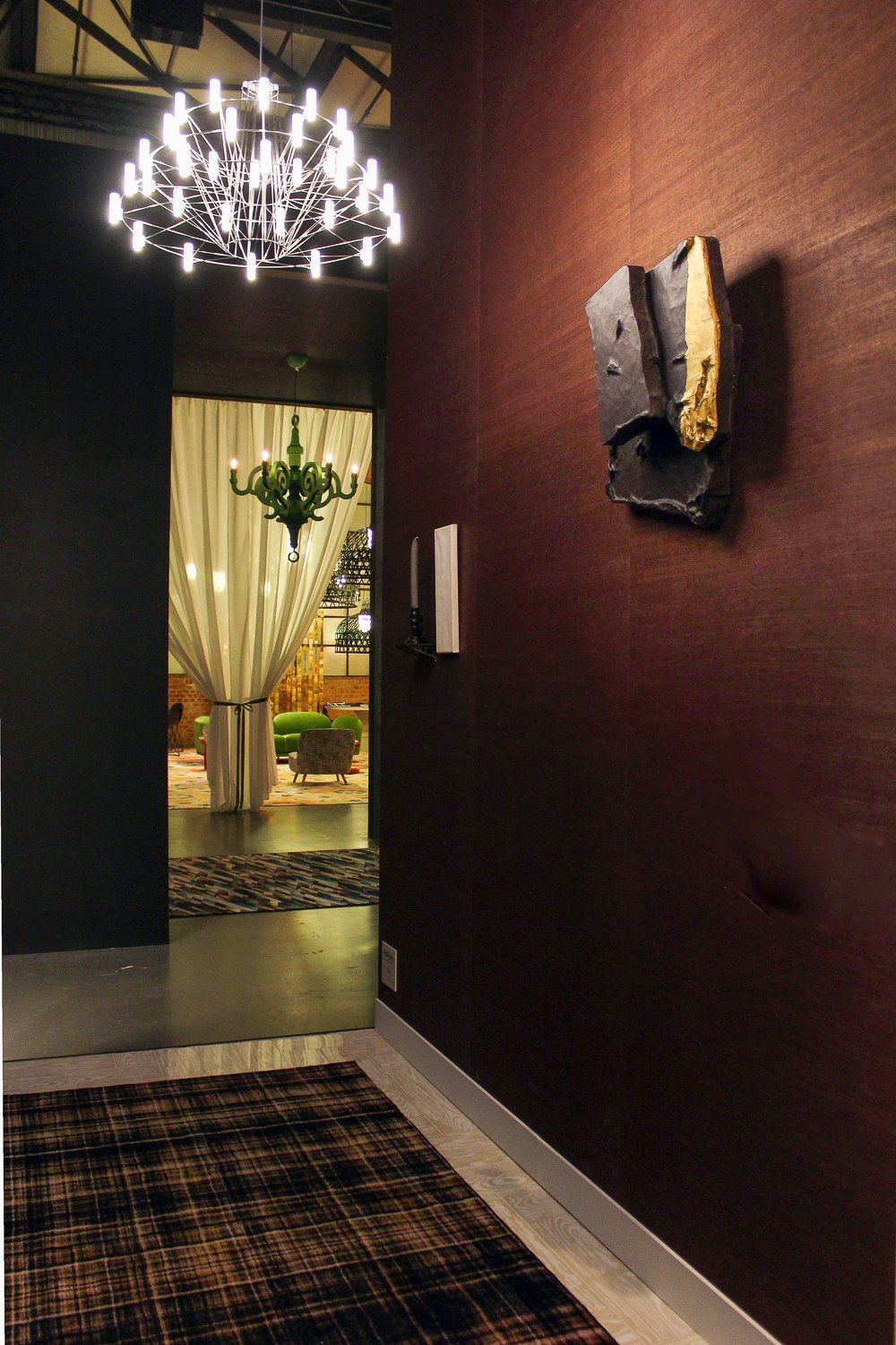

Threefold by Guido de Waart
Will everything remain in the same place until the end of Milan Design Week?
“Definitely not! One of the metal objects from Kunstuitleen Rotterdam, Cintura 6 by A. Schilperoord was on a coffee table until yesterday, right next to a book that I left open on a page with a blue image. A great color combination! But because visitors started to turn the pages, the combination with the dark metal object didn’t feel right anymore. And so I decided to put it back on the cabinet where it started out.

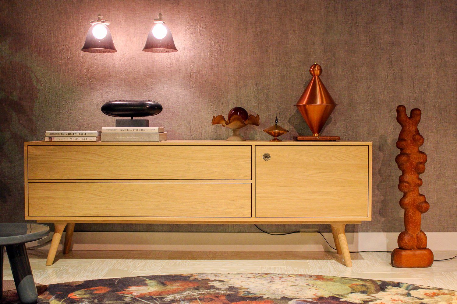
Left: Cintura 6 by A. Schilperoord, right: untitled object by J.A. van Vlijmen
And talking about blue. I deliberately hung this blue piece over the dining room table at an angle. That can work really well with a loose shape.
What advice can you give to the next generation of stylists?
“I think it’s important to be aware of what you do. We stylists are able to create complete worlds in beautiful spaces like this one. But why don’t we do so in places that we don’t like visiting, like a hospital? Especially in places like that our work can make people feel less bad.”
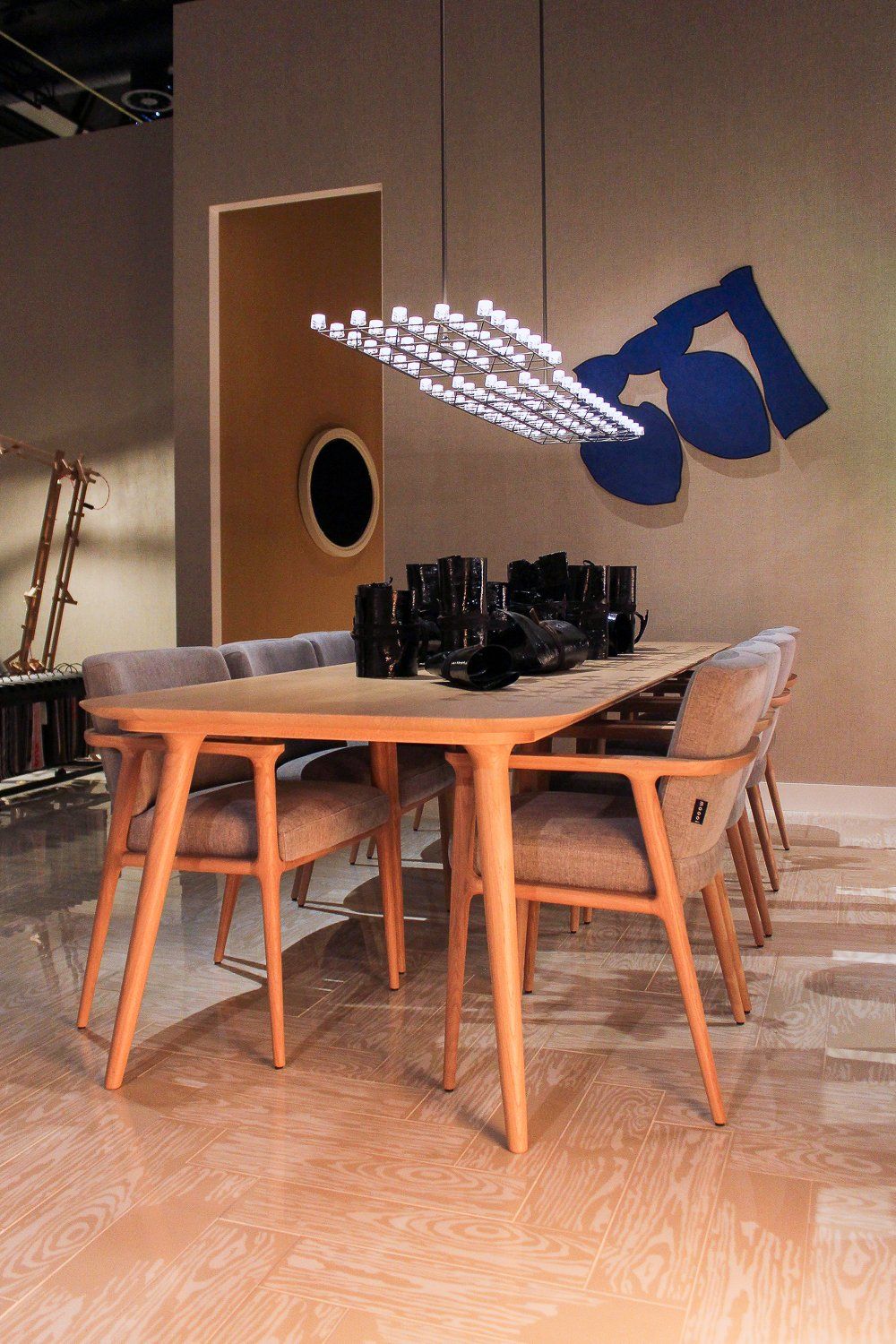

De Kus by P.G. Jansen
All these objects are available for rent at Kunstuitleen Rotterdam
Looking for other inspiration from Rotterdam’s art library? Then check out my interview with artist Simon Schrikker.
