Kvik Prato’s X Module crosses the boundary between your kitchen and living room
True story: Last weekend, my best friend Michel texted me and asked for advice about his new kitchen. He lives in one of those typical late nineteenth-century homes in The Hague – very elegant and great to raise a family in. Like in many pre-war homes, the kitchen is located in…

True story: Last weekend, my best friend Michel texted me and asked for advice about his new kitchen. He lives in one of those typical late nineteenth-century homes in The Hague – very elegant and great to raise a family in. Like in many pre-war homes, the kitchen is located in a separate room next to the living room. That’s all perfectly fine if you’re not heavily into cooking like I am. But when you have two children and like to entertain friends during the weekend, preparing meals in a room the size of a walk-in closet can be a daunting challenge. “Why don’t you move the kitchen to the living room,” I texted back. “You’d have more space, and everything would be right next to the dining room table.” Problem solved, right? I’m still waiting for a reply – I guess Michel is now wondering how the hell he is going to make an open-plan kitchen look good in his stylish living room. I’m sure he’ll get back to me later this week. And that’s when I’m going to tell him about the Dutch press event for the new Kvik Prato kitchen I was at a while ago. I appreciated its sleek matte grey design and stylish black edges – such an advance in kitchen design! What I really loved, however, was its new extension, the Prato X Module that was designed by Danish duo ByKATO. After all, with its wooden trays and sliding doors the Prato X Module looks a lot more like a sideboard than you’d expect. This, of course, makes it the ideal solution if you want a smooth transition between your open-plan kitchen and your living room. I know, it all sounds like I’m making this story up, right? But I’m not – and I have an interview with Danish designer Karl Rossell to prove it!
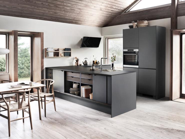

The new Kvik Prato kitchen with its accompanying X Module. Can you imagine how stunning this kitchen would look like with dark grey walls and huge vase with colorful flowers? I know I can! 😉
So, Karl, when I Googled your company byKATO the other day, I saw that your partner Tonny and you are world famous in Denmark for a series of sideboards called the S1?
That’s right – although you can buy the S1 in other countries as well. There’s even an app you can download that you can use to configure your own sideboard. The S1 series is also sold through Andersen Furniture, a company that specializes in solid wood furniture. They celebrated their 100th anniversary in 2016. It’s all very Danish.
I have to admit that minimalist Danish design is a bit outside my comfort zone, even though it has a very impressive tradition. Don’t you ever feel constrained as a Danish designer?
Not at all! In fact, telling people I’m a designer from Denmark definitely opens a lot more doors when I’m abroad. You also have to keep in mind that what the Danish do is very functional.
Which I guess is perfect for a kitchen!
Yes, I guess we leave the more frivolous stuff to Dutch designers like Marcel Wanders. Tonny and I would never design something that we wouldn’t want to have in our own home in Copenhagen.
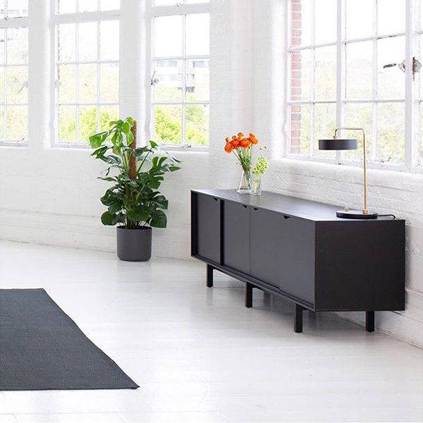

As you can see, the design of the X Module is based on this S1 sideboard that byKATO designed for Andersen Furniture. Funny how things can go, right?
So, how did you get in touch with Kvik?
Claus Johnson, who is the head of design at Kvik, had bought one of our S1 sideboards for his own home. He liked the way it looked and started wondering what it would look like as part of a kitchen. After all, they do a lot of trend research at Kvik and had found out that many consumers nowadays like it when a kitchen is part of the living room. It allows them to comfortably entertain friends in the weekend. During the week, however, many people don’t cook and don’t really need a big kitchen workspace. That’s why they also find it important to have a kitchen that sort of blends in with the living room. Our lightbulb moment came when we realized we should take elements from our S1 sideboard and cross them with the new Kvik Prato kitchen. That cross is why we decided to name this concept the X Module.
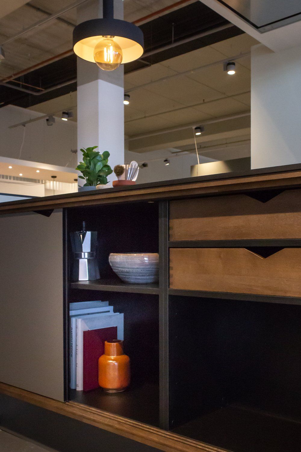

What a beauty! The X Module features wooden trays and sliding doors and makes the transition between your kitchen and living room a lot softer.
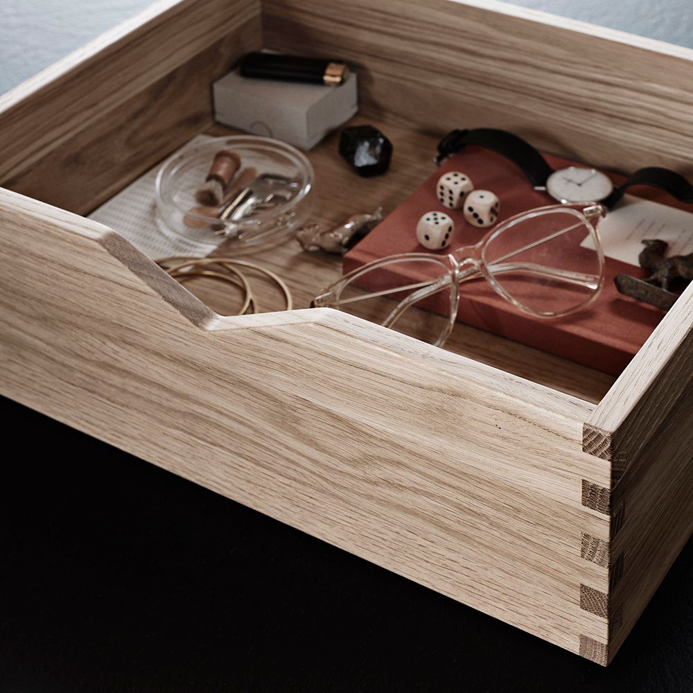
The X Module features both traditional fingered wood and modern diagonal cutouts as door handles – a combination you don’t see very often.
It’s old school with new school details. I like to think it’s the signature for the entire series. We also wanted the X Module to be practical and affordable at the same time. You can configure it any way you want – open, closed…you name it. The panels come in different colors, but you can turn them around if you prefer the black backside. I even know a couple who switch colors depending on the season. The most challenging part of the design process, however, was to try and keep costs for production and shipping as low as possible. That allows Kvik to keep their kitchens affordable.
What does your own home look like?
We live in a classic yellow brick building on the outskirts of Copenhagen that was built in 1894. My favorite item at home is the Construction Lamp that Joost and Kiki designed for Moooi. I bought it at Illums Bolighus, which is my go-to design store. We’re also thinking of moving the kitchen to the living room. That way it’s closer to our backyard, which is where we do most of our entertaining when the weather is good. I guess I need to talk to Kvik about getting a new kitchen!
