Farrow & Ball’s Colour Consultancy Manager Patrick O’Donnell: ‘In the end, your home is about you.’
If there is one thing I like best about being an interior design writer, it’s meeting new people who share my passion for creating wonderful homes. Patrick O’Donnell was no exception. As manager of Farrow & Ball’s colour consultancy service, he understands like no one else how colour can make –…
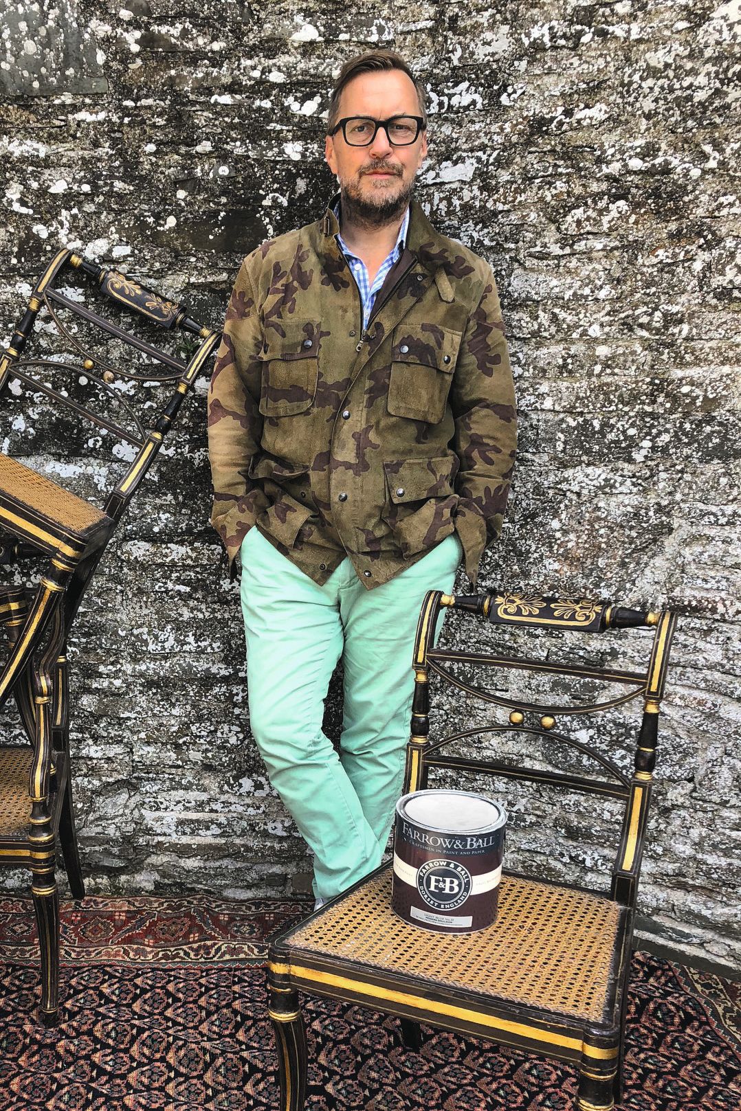
If there is one thing I like best about being an interior design writer, it’s meeting new people who share my passion for creating wonderful homes. Patrick O’Donnell was no exception. As manager of Farrow & Ball’s colour consultancy service, he understands like no one else how colour can make – or break – your interior. I met up with Patrick a while ago and talked about everything from the comeback of English country house style to the one colour consultancy trick that works without fail.
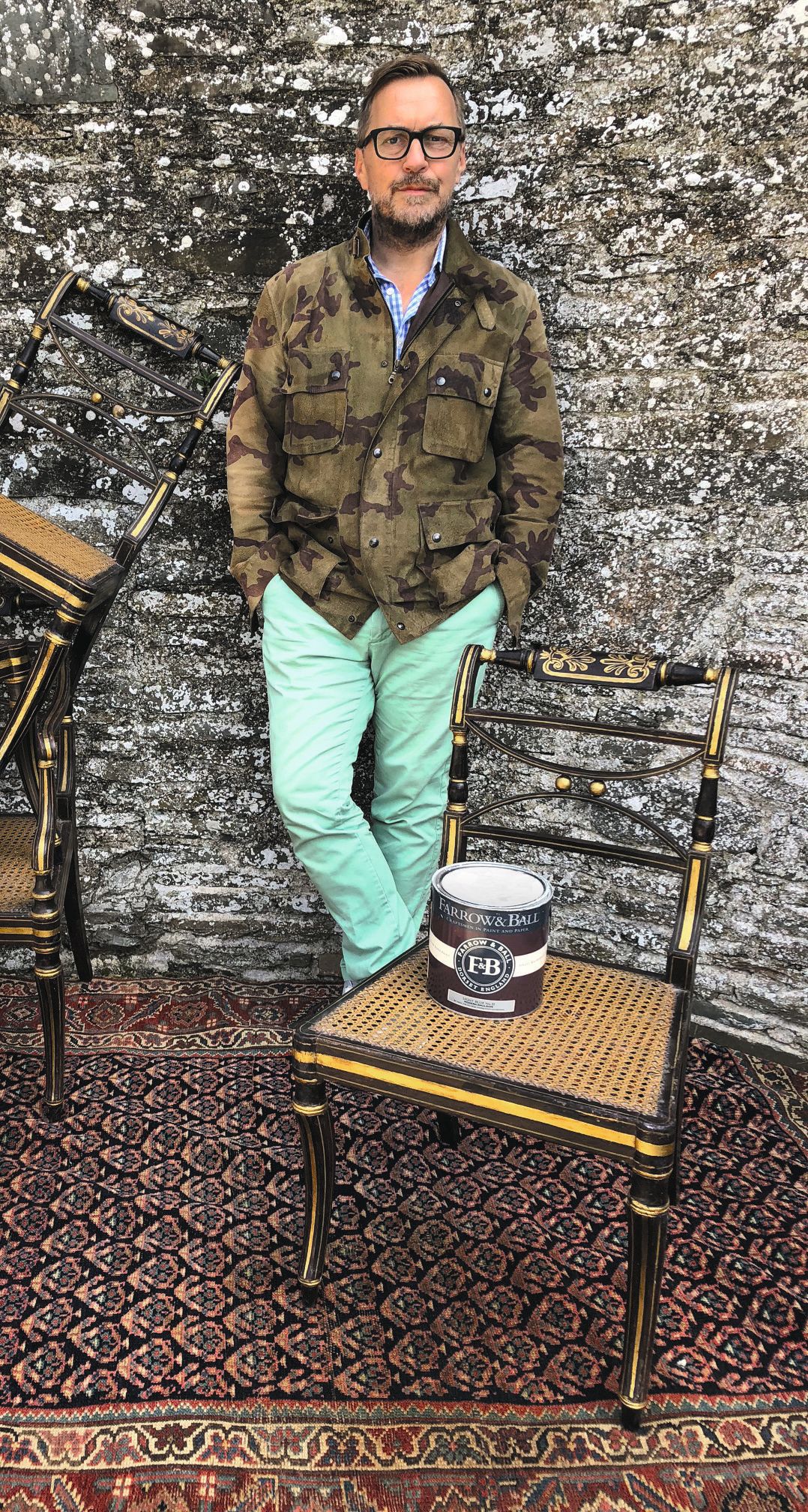
There’s one thing I’d like to find out first – what does the home of Farrow & Ball’s International Colour Consultancy Manager look like?
My partner Paul and I live in a predominantly Victorian castle in Northern Ireland. It’s one of the oldest inhabited castles in the area. In fact, the original Norman part dates back all the way to the 12th Century. The castle is owned by friends of ours. We’re decorating it so that they can use it as a business address and a holiday home later on. Our style is very relaxed English country house. I think that is appropriate for a castle of its age. When we first moved in, the place still looked like a generic suburban home. But we’ve changed all that. It now looks so much more authentic.
Not many people have the talent to decorate the interior of a 12th Century castle. I’d love to find out how it all came about.
Well, I grew up in the Midlands on the edges of Birmingham. I have to say I had a fairly conventional childhood. I come from a middle class family with no creative influence whatsoever. For some reason, I’ve always been very creative. My parents indulged me and just let me get on with it. I did have a very supportive art teacher at the all-boys school I went to. He recognized my talents such as they were. I ended up studying History of Art. I guess I wanted to understand what I was doing. Art history gave my creativity and my drawing context. After a while, I realized I wasn’t as good as I thought I was and I walked away from it all. I started auctioneering in fine art and working for decorating firm Colefax & Fowler. I also took classes at Leonard Pardon, a school in Knightsbridge that specializes in painted murals and trompe l’oeil. It was so fashionable in the late Eighties to have marbled walls or malachite! In between commissions, I also started working as a runner for film and television.
Wait – what?
I know, I used to be quite chaotic. Creative minds are quite restless people. In any case, I loved the unpredictability of the film industry. It fit me quite well and so I ended up as a first director doing lots of film work. There always was a huge sense of camaraderie on set, everyone became my second family. The days were very long, I worked six days a week and had to make a lot of sacrifices. When I realized how many times I had missed my godchildren’s christening or family members getting married, I decided to walk away from it all. I also worked for Moyses Stevens for a while, which is a very old by royal appointment florist on Sloane Street in London. It was the worst job I had ever done, but it was beautiful working with fresh flowers. I also had a very interesting clientele that included Chanel, Gucci and Paul & Joe. Before I moved to Northern Ireland to be with my partner, I guess I was a Jack of all Trades and a master of none. It didn’t matter, as long as I was making the world a more beautiful place.
Is that what you like about interior design?
I suppose so. I can really enjoy an interior that is well put together. Good friends of mine in Oxfordshire bought this amazing house which was owned by Nancy Lancaster. She was the owner of Colefax and Fowler and principally responsible for inventing the English country house look back in the 1920’s. The house was perfect on every level. There was some amazing trompe l’oeil painted by George Oakes, who was John Fowler’s right-hand man. And the furniture was spot on. It wasn’t too perfect. Everything was quite grand and very relaxed at the same time. I just love that balance. There is a huge renaissance of that country house look at the moment. Just look at designers like Max Rollitt and Ben Pentreath. I also love Susie Atkinson’s design for the Beaverbrook Hotel in Surrey.
It’s all part of a larger international trend, don’t you think? Interior design used to be very minimal and Scandinavian, whereas now it seems to revolve around luxury and storytelling.
When the world feels unsettled, people need a more nurturing environment. We’re using a lot more colour in interior design now. You can definitely see a more romantic palette coming back in.
I guess that brings me to your current job! What do you like about Farrow & Ball?
I’ve never worked for a company where everyone believes in the product so much. It’s a passion. We also stick to who we are, even though commercially it would be really tempting for us add a few more bright colours to our range. In the end, however, we don’t want to be all things to all men. Besides, the nice thing about Farrow & Ball is that we have an archive colour fan, which means we never really lose a colour. Everything is still available. There are some hot, strong primary colours that you’d probably love.
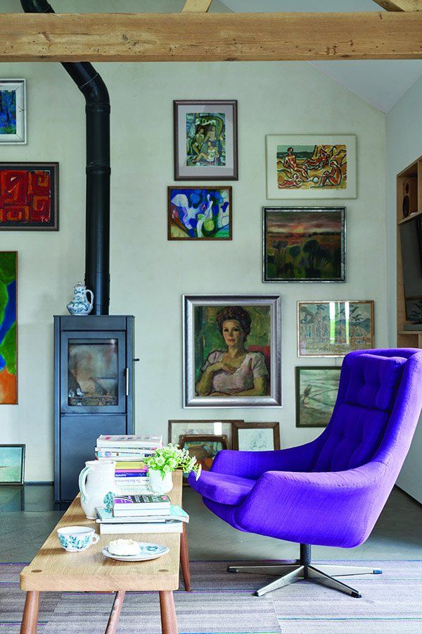
A while ago, I kept being called by a number in Qatar. I hesitated answering, but it just kept ringing and ringing. It turned out to be a man from Doha who had visited our London showroom and needed help decorating this enormous palace in Doha. I was there for two whole days. It was the longest colour consultancy I had ever done. There were so many choices to be made. We did some crazy stuff, particularly with a strong green archive colour called Acid Drop. I suggested a lacquered version to make all high-gloss Poliform furniture really pop. Can you imagine the result? Of course, there are some beautiful muted colours on the archive fan as well. It almost doubles the palette we work with.
How does the Farrow & Ball Colour Consultancy work?
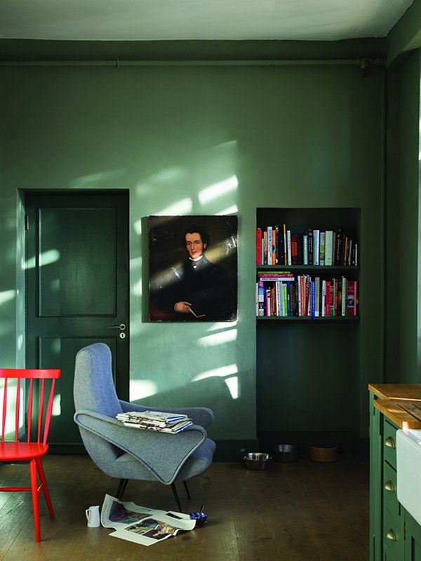
Joa Studholme, who is the colour curator at Farrow & Ball, set it up in 2011. She is responsible for the colour palette, together with Head of Creative Charlotte Crosby. I took over the Colour Consultancy service in 2014. It revolves around the idea that there is a limit on the advice we can give in our showrooms. Since our pigments are natural, they will change dramatically in different light sources. Our colour consultants know how our paint reacts to different environments. In a north-facing room, for example, some colours can feel flat or cold – and that is definitely something you can avoid. Working with a colour consultant is also great if you want a minor refresh without going through a traditional interior decorating experience that obliges you replace all your existing furniture. It’s definitely a more affordable solution to rethink your home. Technically, we are selling paint and wallpaper, but we don’t mind rearranging some of the furniture if that helps. It’s interior decorating light, if that makes sense.

What are the most important lessons that you can share? I can imagine you don’t want to give everything away.
We want people to be happy with our product, so we’re more than happy to share everything we know. In fact, Joa even published a book about it called How to Decorate: Transform Your Home with Paint and Paper. Our website is also loaded with information and special colour combinations that you can use if you’re uncertain. At Farrow & Ball, we try to let the entire process be very personal. We don’t dictate trends and we certainly don’t dictate people how to decorate. We’ll gladly help you, but in the end your house is about you. It’s about your personality and what you’re comfortable with. Did you know, by the way, that more often than not it’s about finding the right product and not necessarily about finding the right colour? If you’ve got loads of children running around, you need our washable Modern Emulsion. It’s so much more practical.
Do customers always follow the advice you give them?
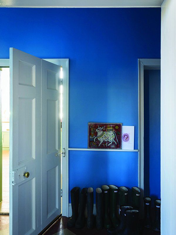
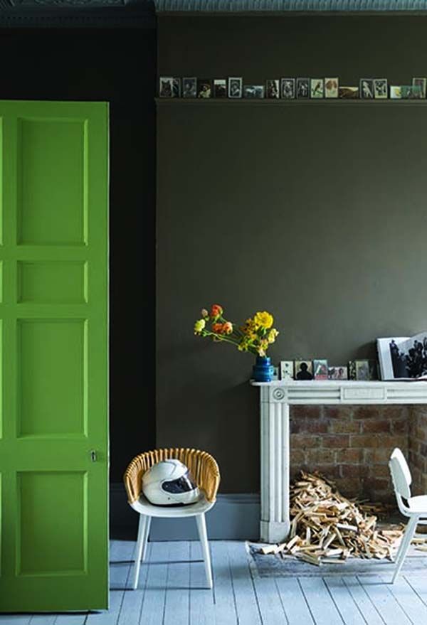
A lot of people are quite uncomfortable with colours, which explains why 7 colours in our top 10 are still neutrals. My one trick is to challenge them to paint the downstairs toilet first. You’re not going to spend a lot of time there, it’s not a social space and so it’s the perfect place to do something left field. It’s amazing how many people become converted that way. I love tempting people to do something a bit more adventurous in the living room after that. Some of my clients even did this really crazy off-black gloss.
That’s extraordinary because it’s my experience that many people are afraid to go all in and end up painting only one wall.
I have a hate which is called the feature wall. It’s like my Achilles heel. The only way I’m happy for it to exist is if you have a really awkwardly-shaped room. In a very long rectangular space, for instance, it can help to square up a room by painting one end wall two tones darker. I will use it for visual trickery, but I can’t bear extreme contrasts in a space. I quite like rooms that feel unified. Feature walls are always too sharp and give the impression that you’ve run out of money. It’s even worse with wallpaper.


Farrow & Ball’s Block Print Stripe wallpaper
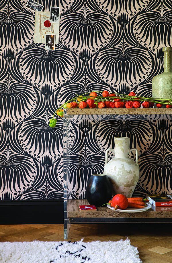

Lotus wallpaper by Farrow & Ball
I have to admit that I made that mistake once – and never again. Talking about wallpaper, can it be part of a colour consultancy?
Oh, definitely! Our colour consultants always bring a portfolio with our bestsellers. Farrow & Ball wallpapers are hand-blocked and have a very tactile quality to them. Of course, the best way to see a wallpaper is on a wall. But obviously the biggest advantage with our wallpapers is that they match our paint. If tonality is important to you, our colour consultants can help you create a nice symbiosis between the two. Wallpaper is much more of an investment than paint. It’s interesting to see how it’s coming back in style.
The pendulum always swings back and forth, I guess.
There are cycles, different colours and patterns always come around. If you look at the catwalk, paisley and tartan are in every five years or so. Right now, I’m rooting for a renaissance of yellow. A while ago, someone at Farrow & Ball showed me this photo of a hallway that was painted out in Yellowcake and I loved it.
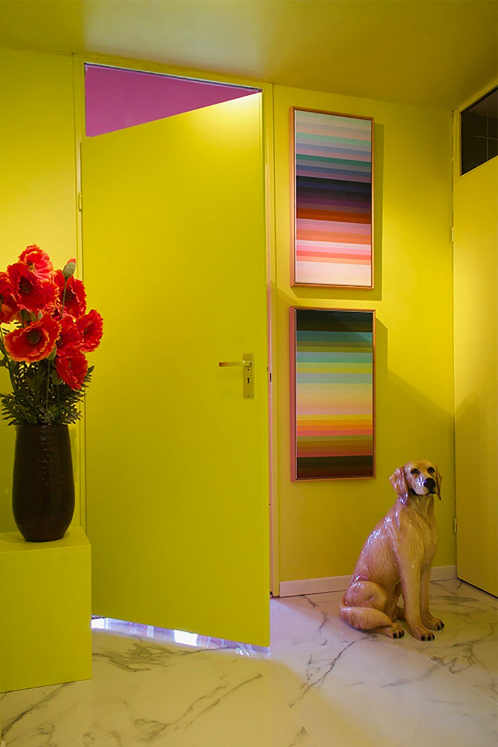
My hallway in Farrow & Ball’s inimitable Yellowcake.
That was my hallway! I never follow trends, however.
And neither do we at Farrow & Ball. That doesn’t mean we don’t understand trends. We’re aware of them, but we’re not slaves to them.
Do you need help picking *just* the right colours for your home? Then book your Farrow & Ball Colour Consultancy right here! And don’t forget to tell me how it went.
