Dutch Design Week 2022 – The Delicious Eye Candy Edition
You want eye candy? Well, I got it! I was at Dutch Design Week 2022 to check out the most visually appealing design out there at the moment – let’s dive right in! Dutch Design Week 2022 – Manifestations at the Veemgebouw I started my whirlwind tour of Dutch Design Week…

You want eye candy? Well, I got it! I was at Dutch Design Week 2022 to check out the most visually appealing design out there at the moment – let’s dive right in!
Dutch Design Week 2022 – Manifestations at the Veemgebouw
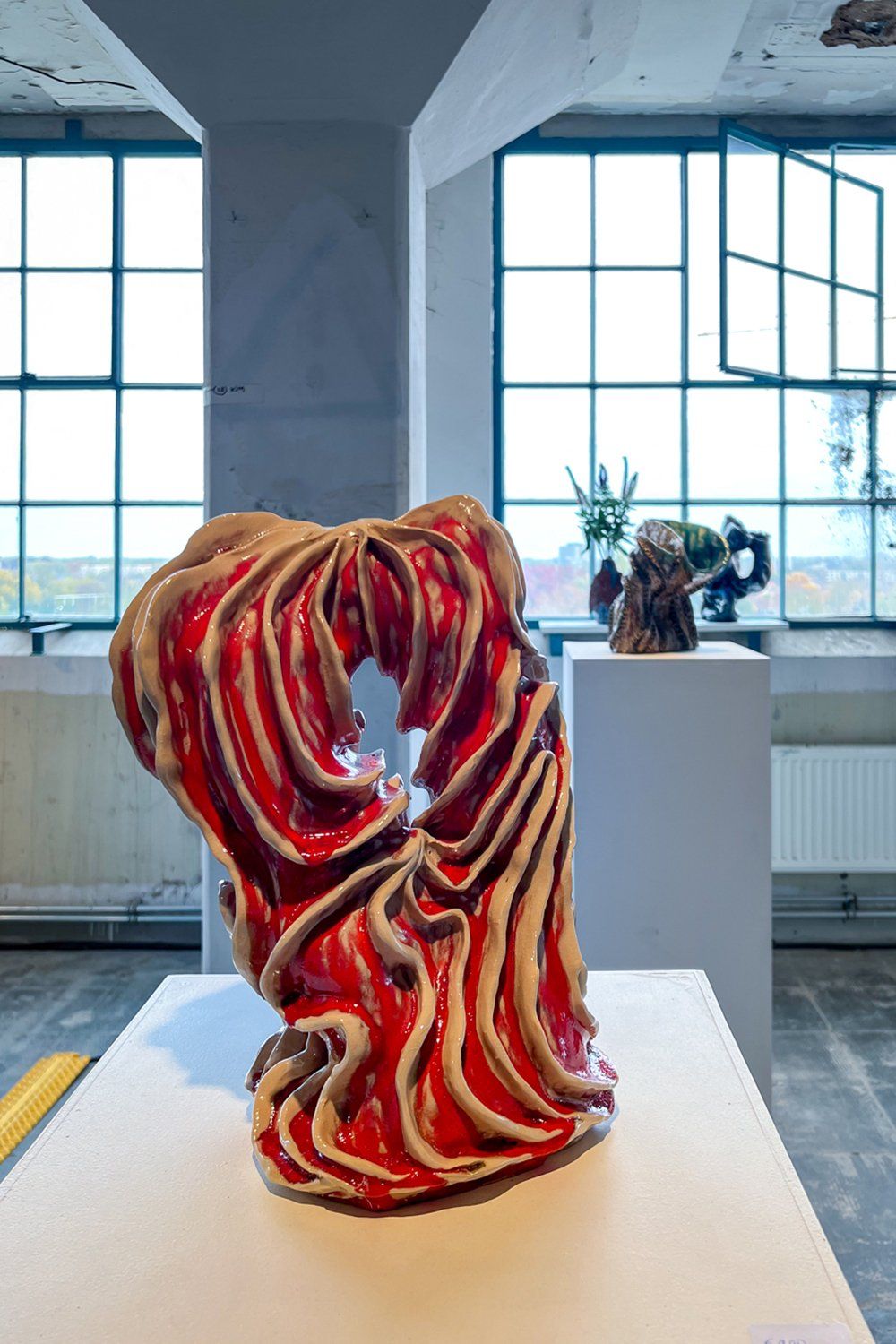
I started my whirlwind tour of Dutch Design Week 2022 at Manifestations at the Veemgebouw, which was a surprisingly good exhibition featuring young designers working at the intersection of art and technology. Literally the first thing I saw was this stunning ceramic object by Tamar Yogev. In an ideal world, this would have actually been a vase, but I guess you can’t have everything in life.
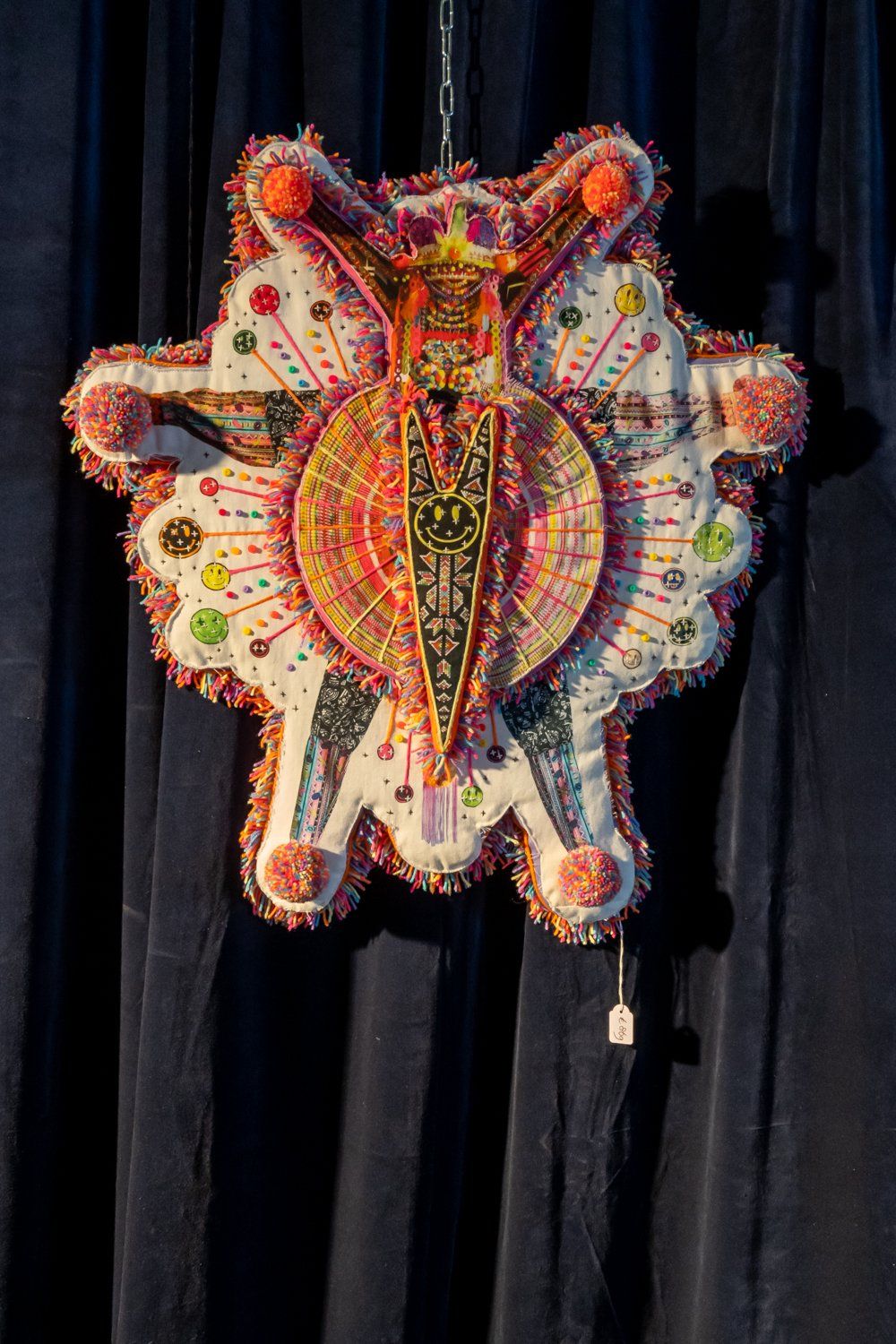
I’m a sucker for colorfull stuff with lots of bells and whistles to look at, so this fabric wall object by Studio Mar-vellous was right up my alley.
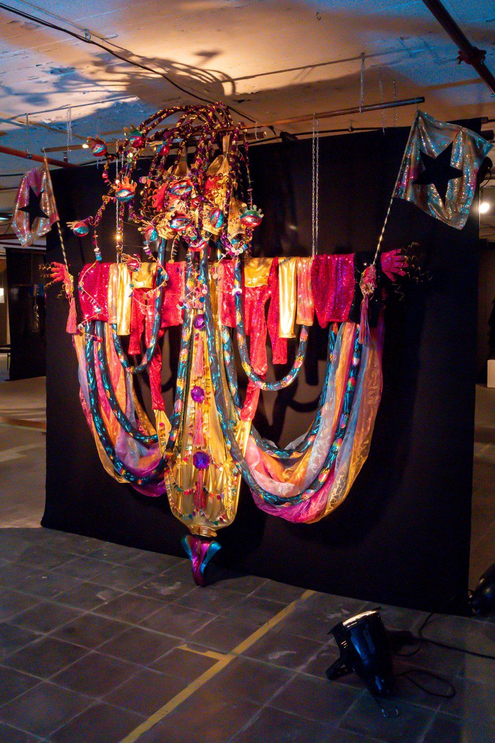
Let me close my eyes for a second and wonder what this fabulously over the top costume – again by Studio Mar-vellous – would look like here at home.
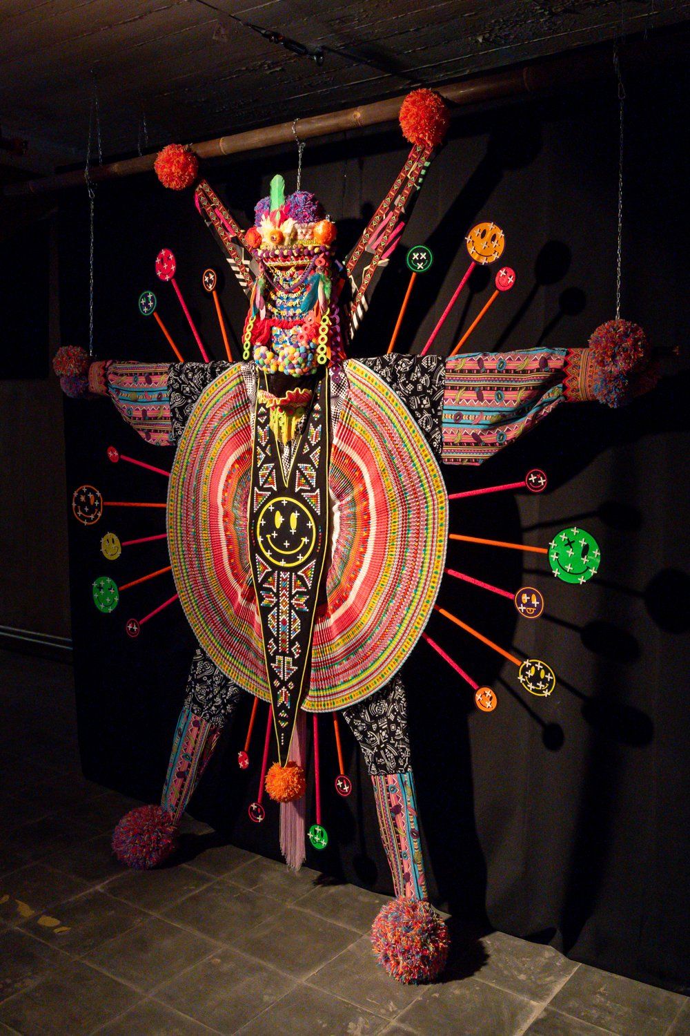
This looks like that night I spent a week at Lowlands in high on acid (true story from my Naughty Nineties – but so glad those days are behind me).
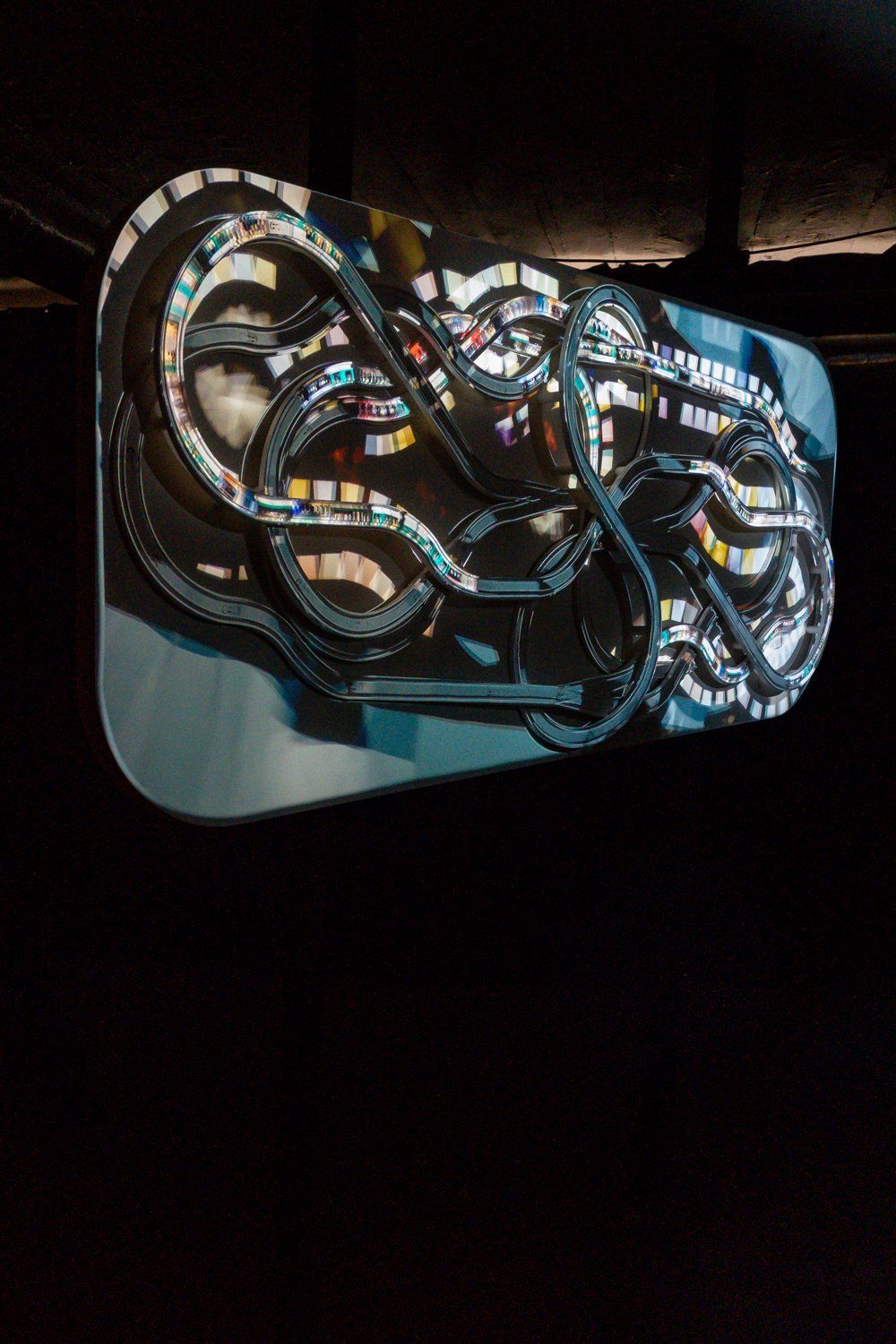
This photo of artist Adriaan Lokman’s project Timeshells really doesn’t do it justice. The video projection of toy cars moving over these tracks was totally mesmerizing. I’d say, time to check out Lokman’s Instagram Stories to get an impression.
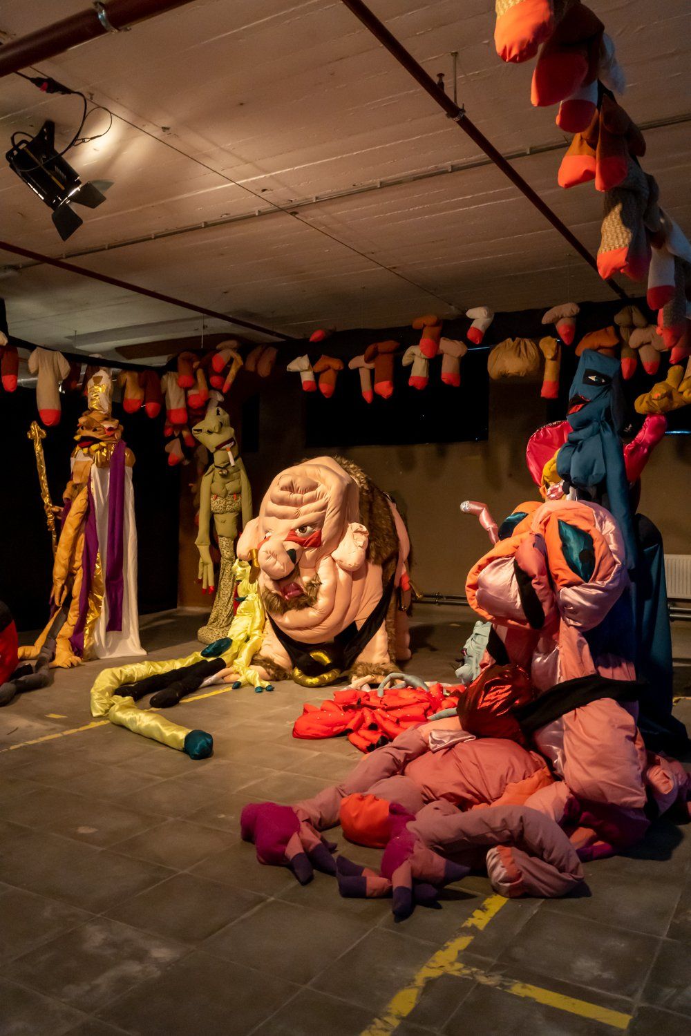
I love, love, LOVE Jurjen Galema’s work. It’s maximalist, it’s tongue in cheek and enjoyable to watch on so many different levels.
Here’s a hilarious video of Jurjen’s drag alter ego Lola Lasagna that you really should check out like right now.
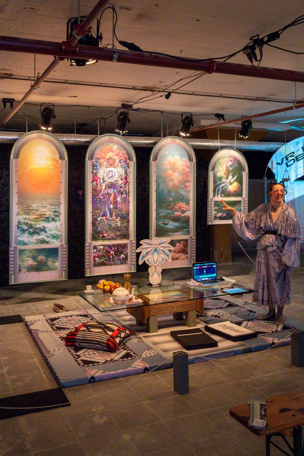
Another fantastic character with amazing work at Manifestations was the one and only digital artist Viola Renate. Her digitally executed wallpaper paintings, prints and ecstatic decor artifacts were an absolute feast for the eye.
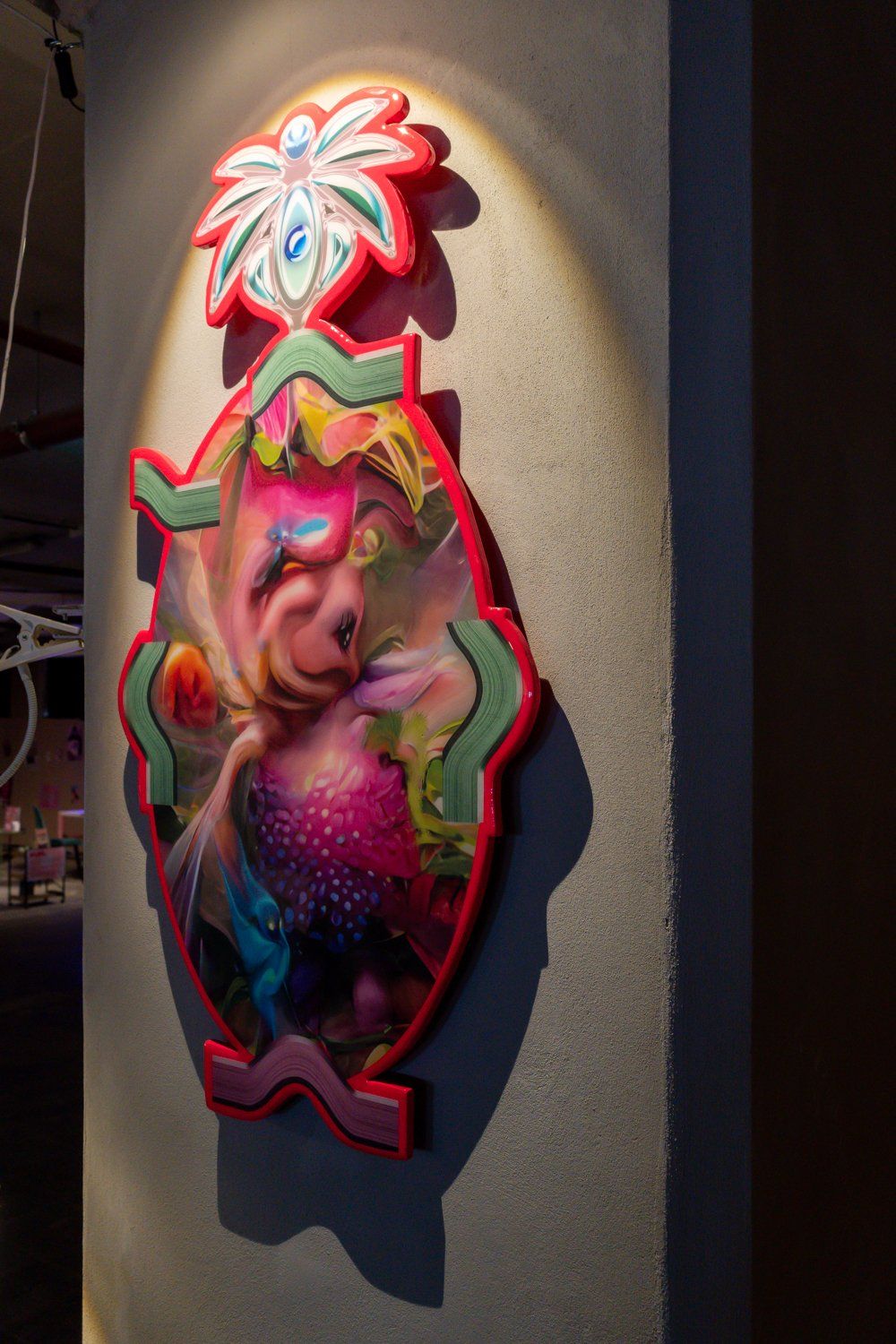
I can totally imagine this totally original piece by Viola Renate here in my living room.
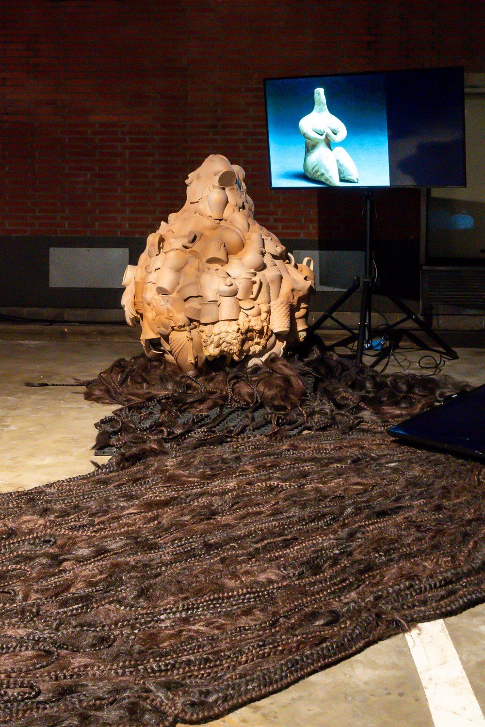
On to the Design Academy Graduation Show, which can be a totally overwhelming experience if you don’t know what to look for. And stupid as it may sound, I tend to focus on the more visually appealing stuff. Te-Yen Hsu’s graduation project, a reflection on the relation between religion and design called O.M.G, definitely did not disappoint in that respect. Great to look at, thought-provoking yet fun accompanying videos – wish I had a few more photos to share with you right now, but I don’t.
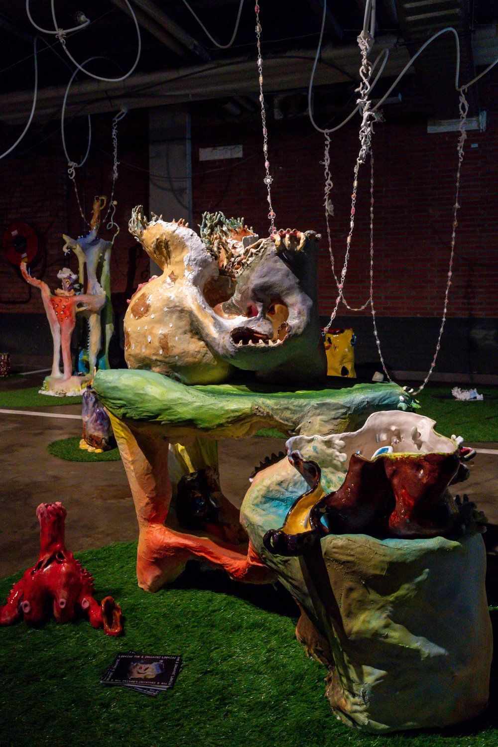
Don’t Leat Me Hanging is the title of Yesum Yoon’s Design Academy graduation project. The title refers to the empty promises that over the counter pills make. If you look closely, you can see them hanging on the chains over a collection of FAB ceramic objects that stole the show.
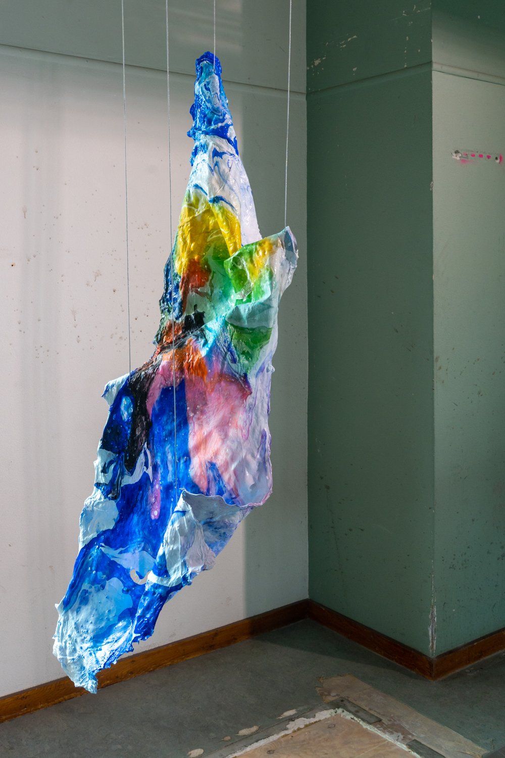
It’s not solid, it’s not fluid – it’s slime! Eva Lotta Landskron is fascinated by the stuff. Why? I’d say check out her beautiful website to find the answer! And I promise you, it’s more interesting than the farts you used to make as a kid by pushing down toy slime in its little plastic jar. Remember?
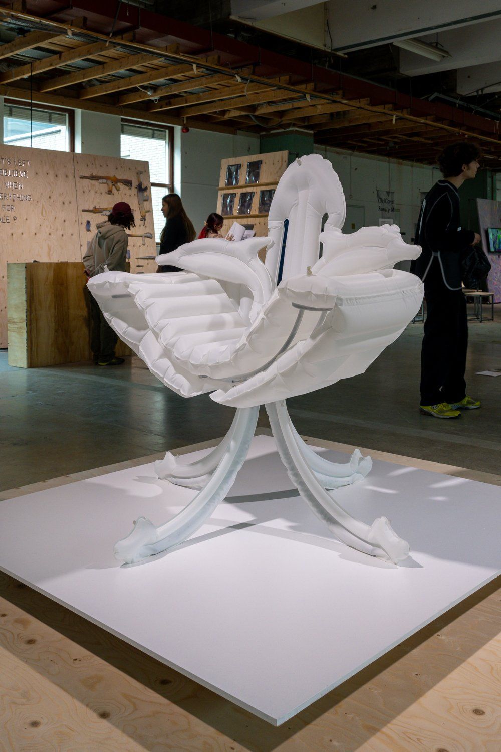
Another great graduation project was this Expandible Ch/air Romain Albers.by As you can see, it’s made from cheap, throwaway inflatables yet looks amazing. Loving the little dolphins, by the way!
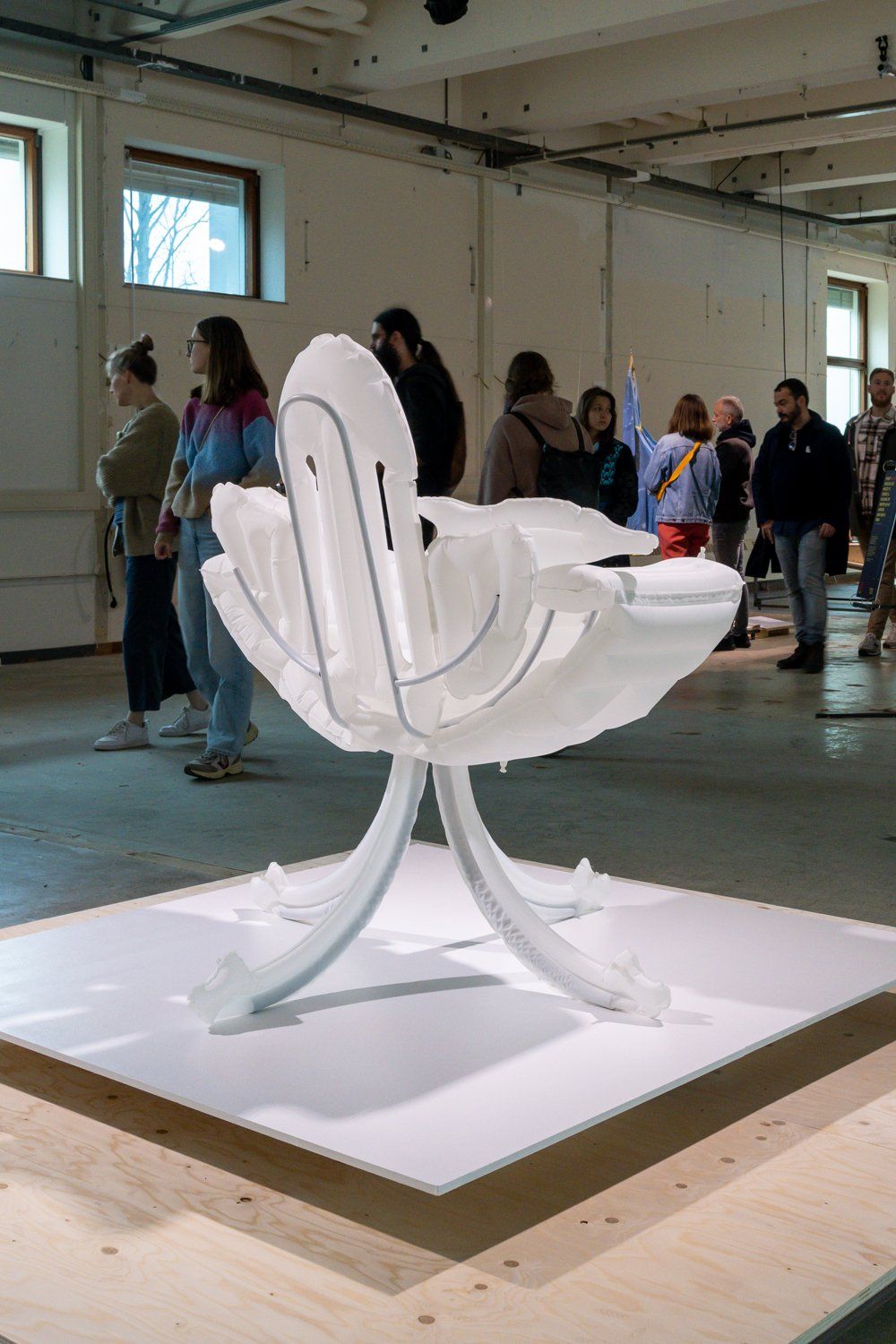
Romain Albers’ chair looks as good from the back as it does from the front.
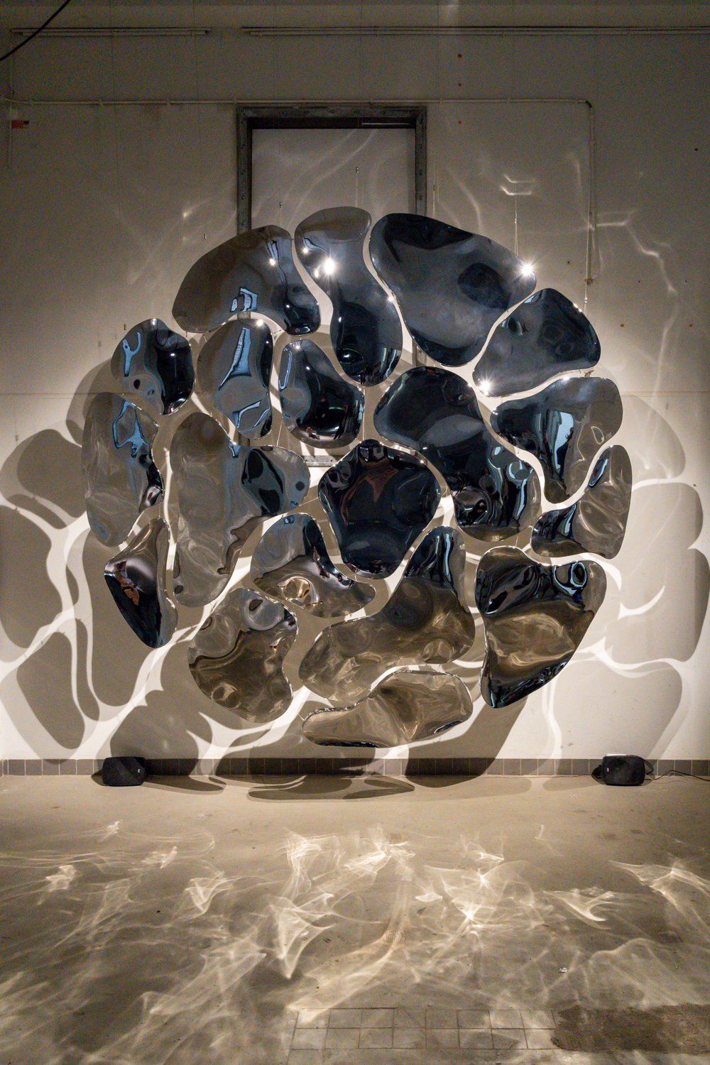
Pepe Triginer Valenti is not only the Design Academy graduate with the most beautiful name of the year, his work is also a sight to behold.
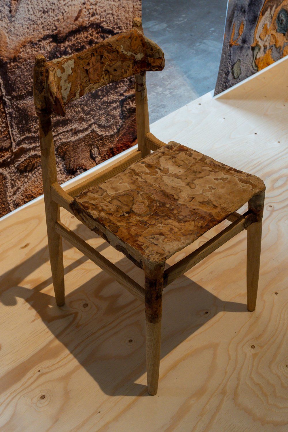
Sustainable product design tends to look really boring – but this material made from leather leftover by Juliana Vérastègue Bayle proves to be the exception to the rule.
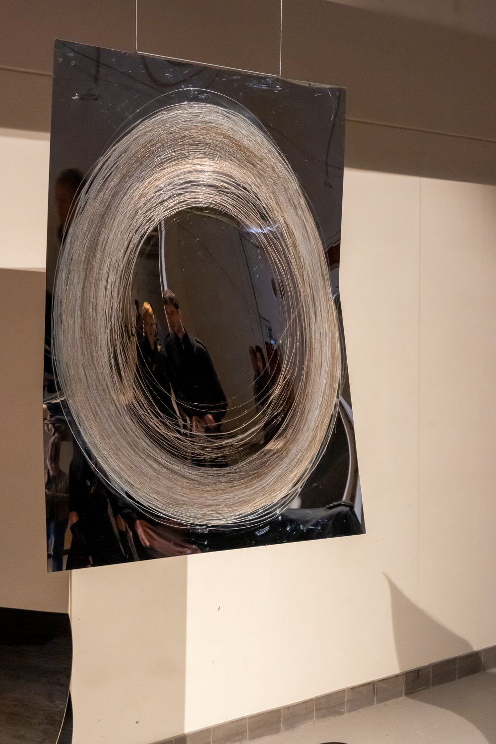
What if you took a plasma cutter, used it as a pencil to draw on steel sheets and then explored what would happen? Well, Jiin Yoon did just that and as you can see, the result looks amazing.
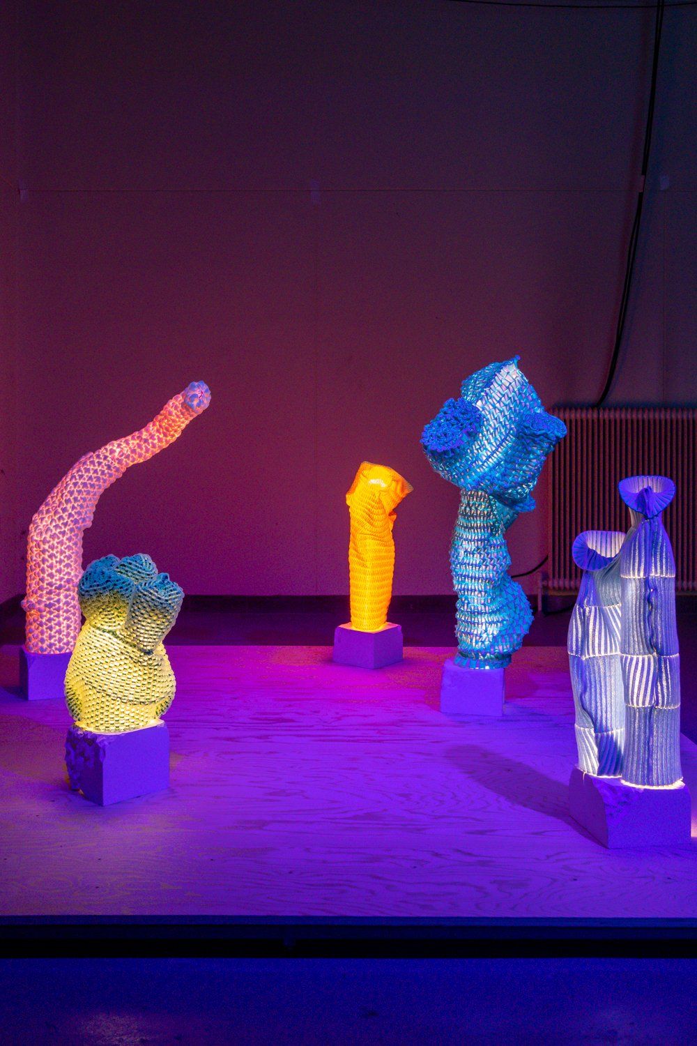
These absolutely fantastic Knitted Lights by Sangmin Oh cleverly combine yarns, light and textiles. Don’t you just love the way they look?
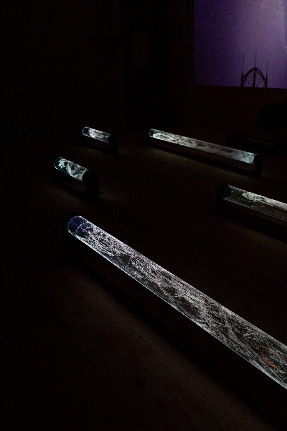
Equally interesting and visually appealing was Endless Etching, the graduation project by Jibbe van Schie. It’s a contemporary homage to intaglio printmaking – and before you ask me…No, I didn’t know what that was either before I visited Dutch Design Week 2022.
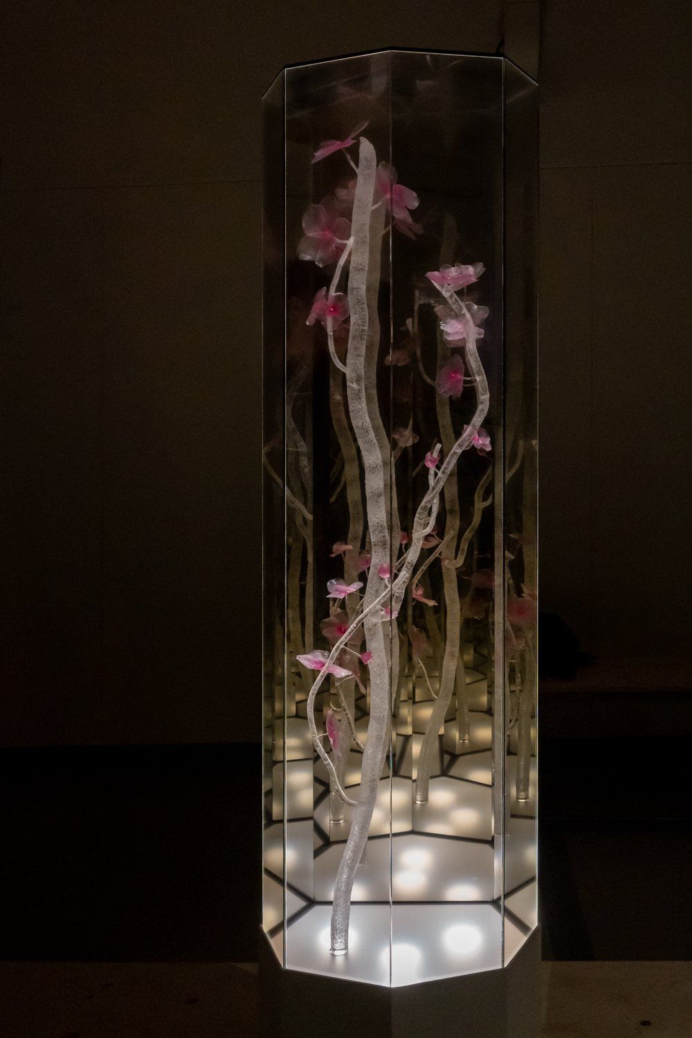
One more for the road! This piece by Mick Thörig is an effort (and a very successful one at that!) by an obsessive collector (digging it!) to find a way to capture even the most ephemeral moment of a Japanese cherry blossom tree blooming.
Dutch Design Week 2022 – Van Abbemuseum
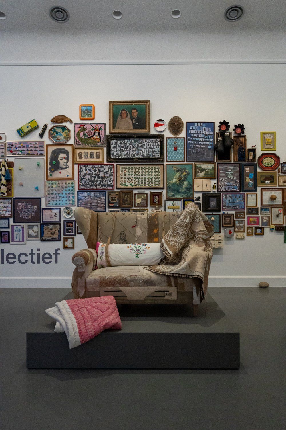
Oh Li! I wanted to like your The Collection Is…exhbition at the Van Abbemuseum so much! All the design on display was lovely but hardly groundbreaking (anymore).
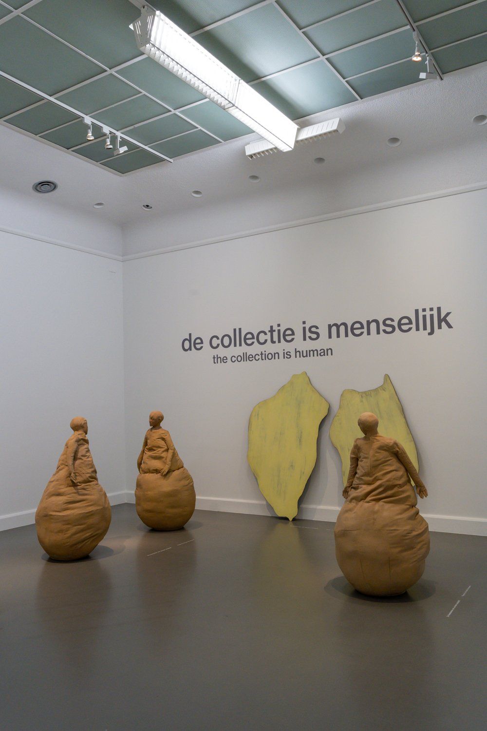
In case you’ve been living under a rock and don’t know who Li is, I’m talking about world famous trend forecaster Lidewij Edelkoort. And apparently, we’re all moving back to minimalism because many of the rooms in this exhibition felt a little empty. And the big ‘The collection is…’ signs in every room were just too big and repetitive.
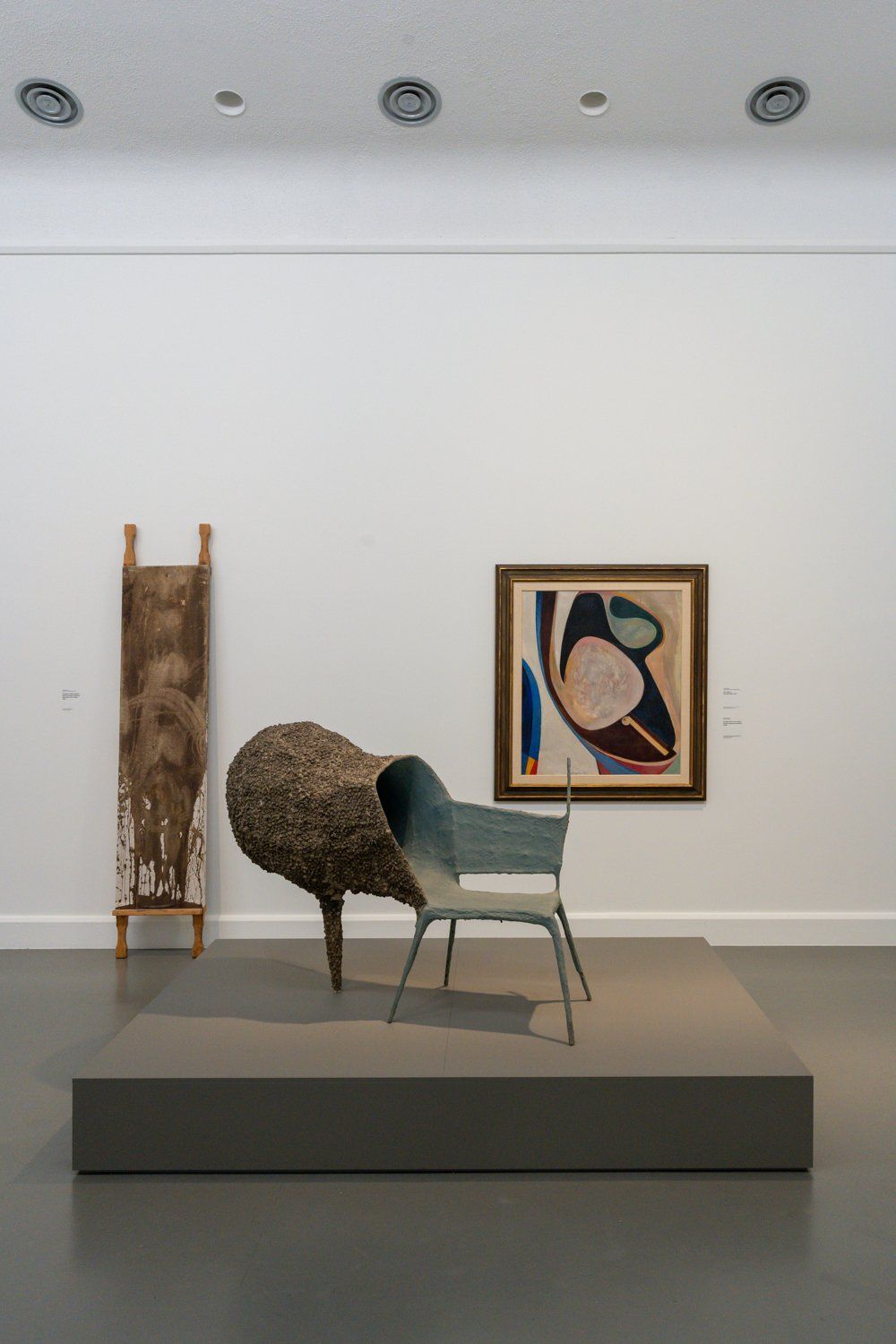
Don’t get me wrong, I love Nacho Carbonell – but this ensemble just looked drab. There, I’ve said it.
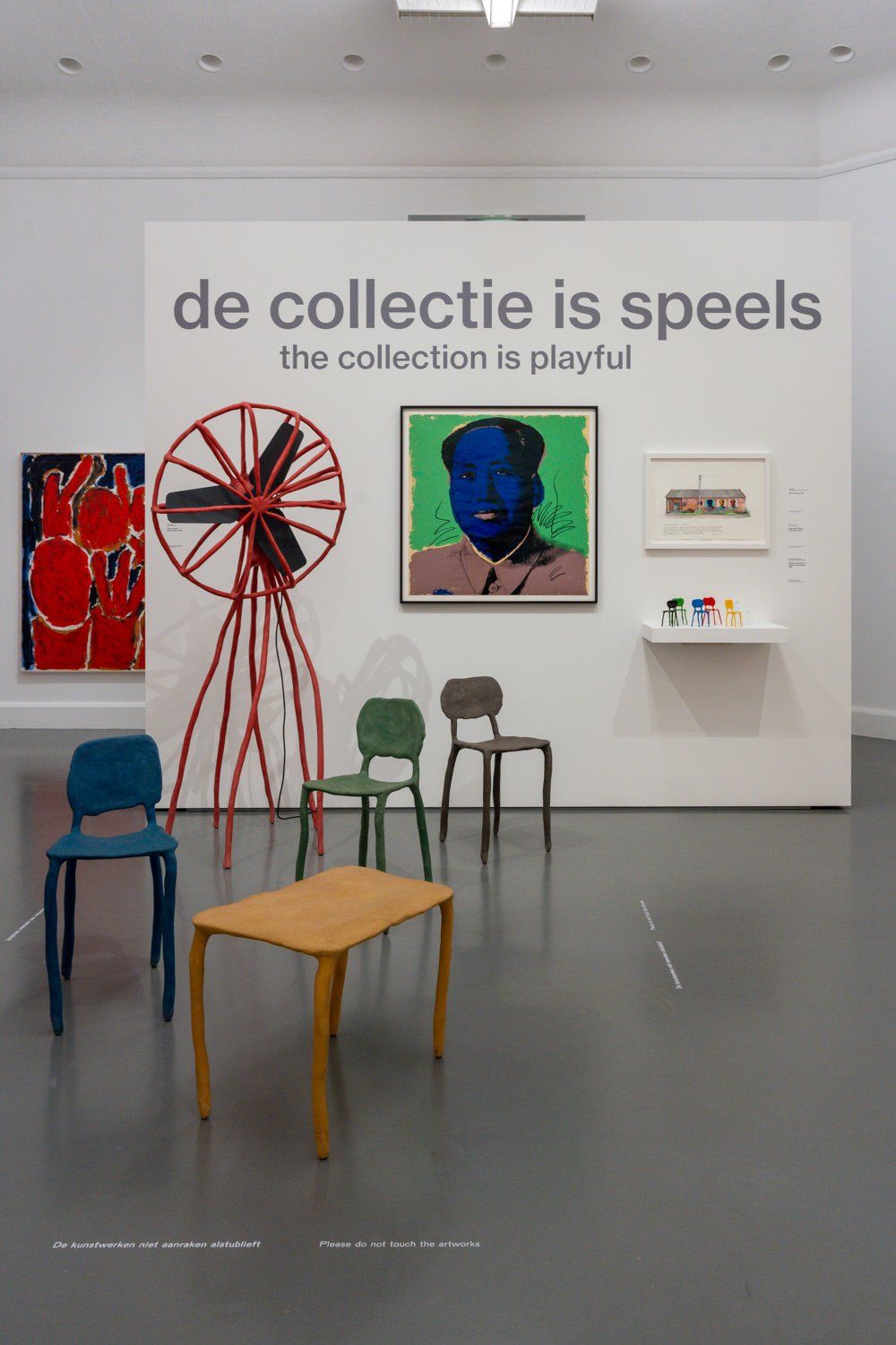
A combination of Maarten Baas chairs and an Andy Warhol painting in matching shapes and colors. Groundbreaking!

You really can’t go wrong with Studio Job, now can you? But wouldn’t it be nice if the setting of these beautiful pieces would have been a little more inspiring?
Dutch Design Week 2022 – De Kazerne
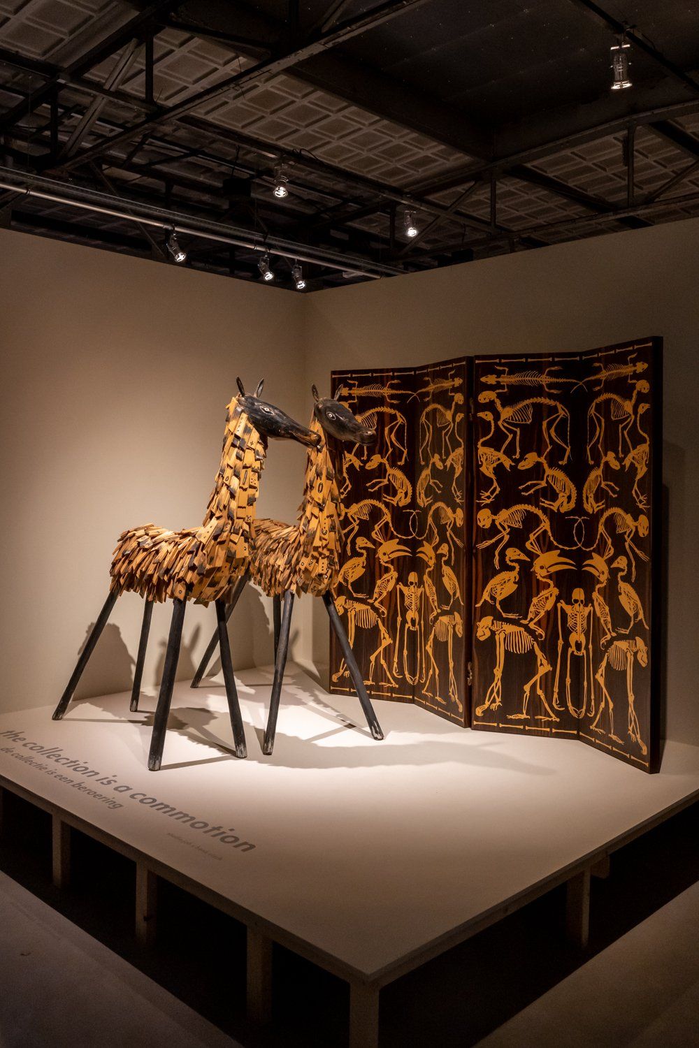
Speaking of Studio Job, here they are again at De Kazerne. And yes, part of Lidewij Edelkoort’s The Collection Is…exhibition seemed to have spilled over into this restaurant and exhibition space.
Frankly, I’m a little bit done with the combinations of the entire ‘two items with similar colors, shapes, materials or patterns’ thing but this combination of a Studio Job screen with the Henk Visch horses looked very cool.
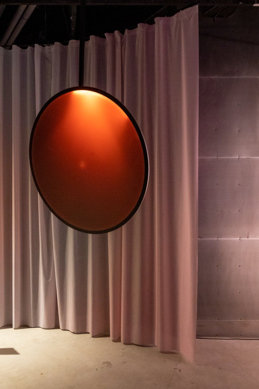
With its beautiful light patterns, this giant circle by Lumus Instruments was so highly Instagrammable, it took me ages to get a clear shot of it.
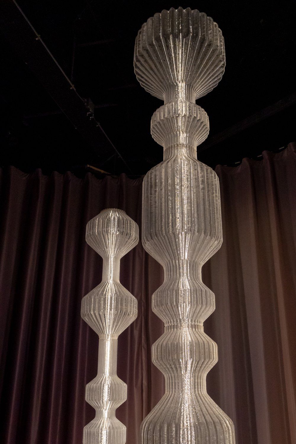
Oh buoy! These Buoy Lights by Lucas Zito are made from plastic produced from corn starch right here in Europe.
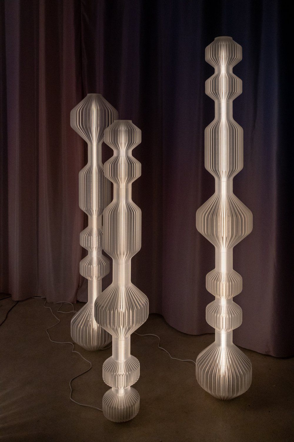
They grow up so fast! Lucas Zito graduated from Eindhoven’s Design Academy three years ago and he’s already making waves in the design world.
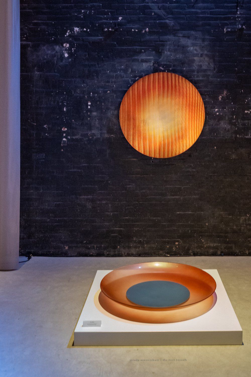
I was bowled over by this giant bowl and Radiance Panel wall object light thing by Rive Roshan.

Tapestries are SO underrated. They add a touch of softness in an interior – especially if they look as nice and flowery as these ones by Tjitske Storm.
<!--kg-card-begin: html--><span data-mce-type="bookmark" style="display: inline-block; width: 0px; overflow: hidden; line-height: 0;" class="mce_SELRES_start lazyload"></span><!--kg-card-end: html--> Liked it so much I even included a little video for you!
Dutch Design Week 2022 – Messmerizing
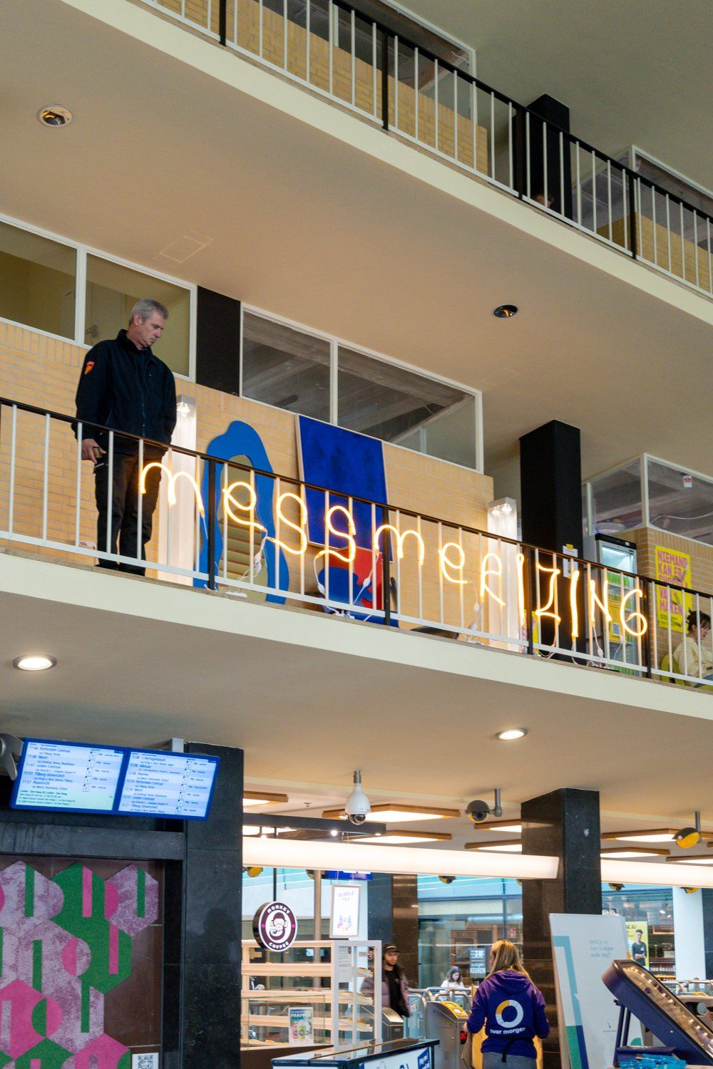
How accessible to you want it? This mini exhibition, called Messmerizing was right at Eindhoven’s Centraal Station.
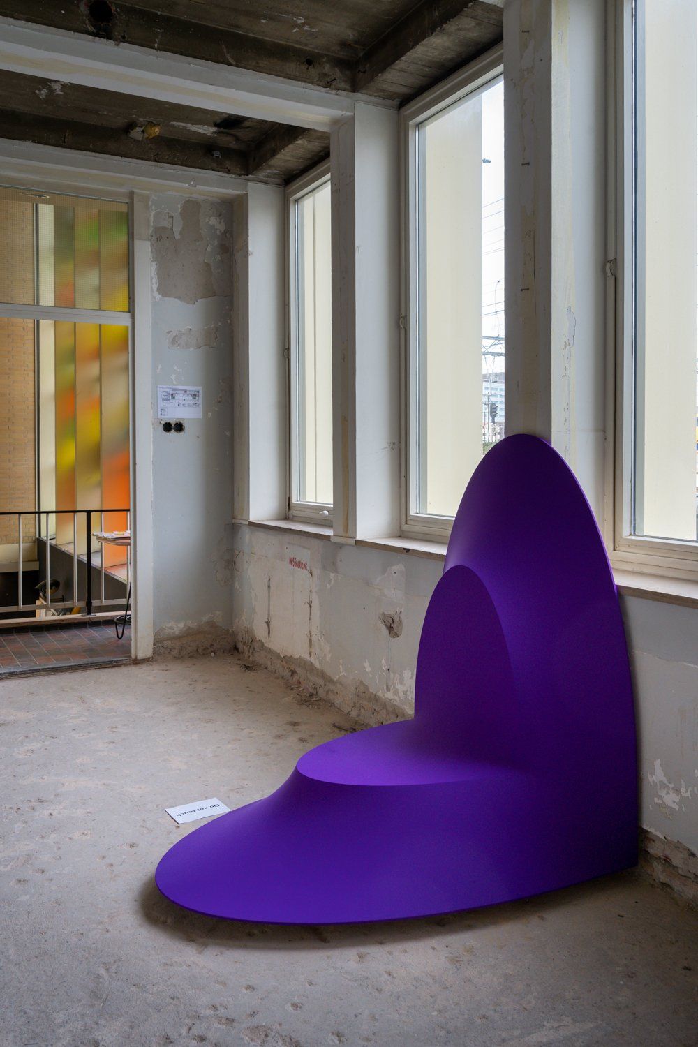
See? This is the sort of stuff I come to Dutch Design Week for! All projects at Messmerize emphasized the perception of form through light and color – and I couldn’t think of a better example than this object by Bold & Schaft.
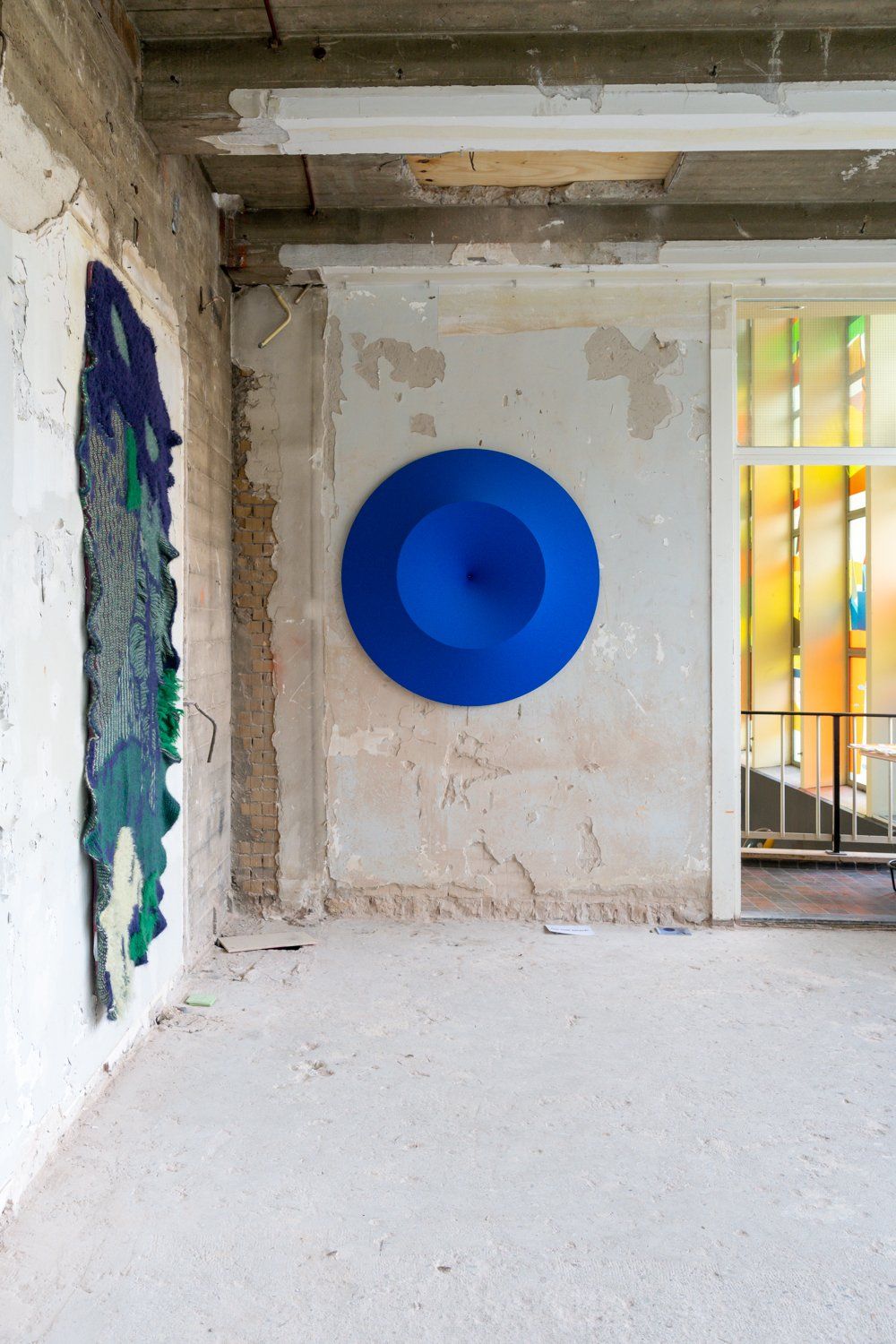
Messmerizing, by the way, was curated by Job Keja and Sandra Keja Planken. I’ve been a huge fan of Sandra Keja Planken’s work ever since I first saw it at Object Rotterdam – check out the blogpost I wrote about that other great annual design event here.
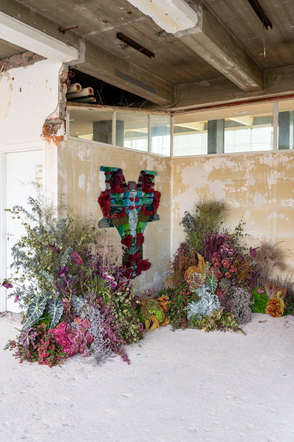
This is a prime example of why I like Keja Planken’s work so much. It’s colorful. It’s fluffy. It’s instantly recognizable. AND it looks great combined with this bizarro yet beautiful floral arrangement.
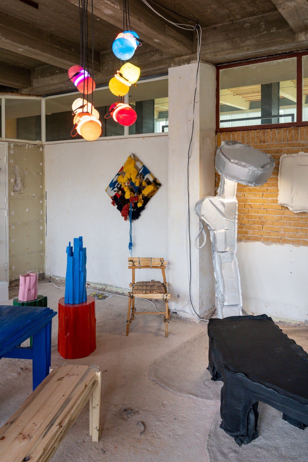
A fantastic installation by Teun Zwets. Colorful, maximalist, right on trend – although I have to say that this sort of quirky ‘slapped together on a spare afternoon’ aesthetic is EVERYWHERE right now. Could it be (dare I say it?) time for something new and more refined?
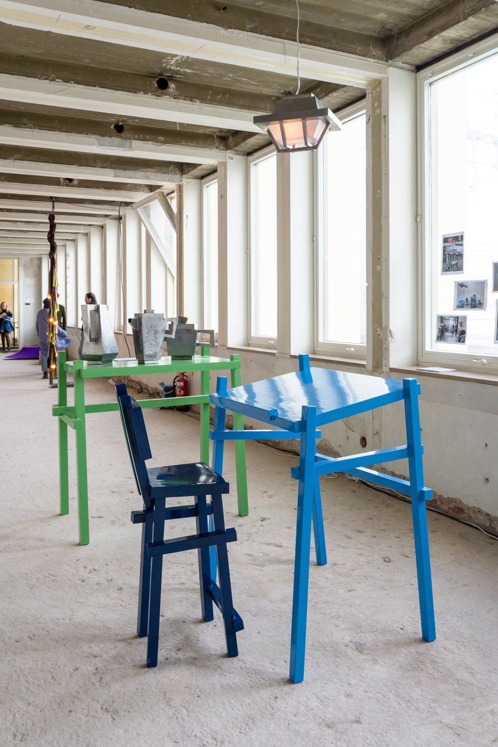
More quirky and colorful design – this time by Dirk van Duivenboden. And let’s face it, in this particular industrial setting, it looks really nice!
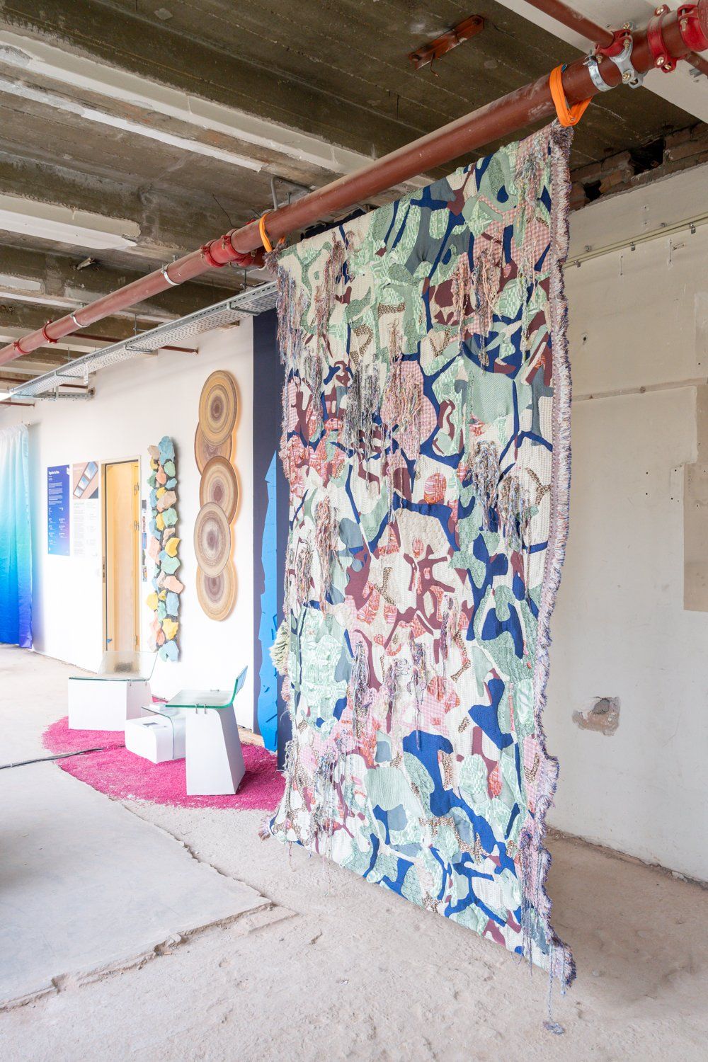
I always do my best take photos of all the names of the designers whose work I’m looking at, but I forgot and for the life of me, I couldn’t remember…until I did my very first Google Lens image search right now and found out that this supernice tapestry is by Sina Dyks. Imagine that!
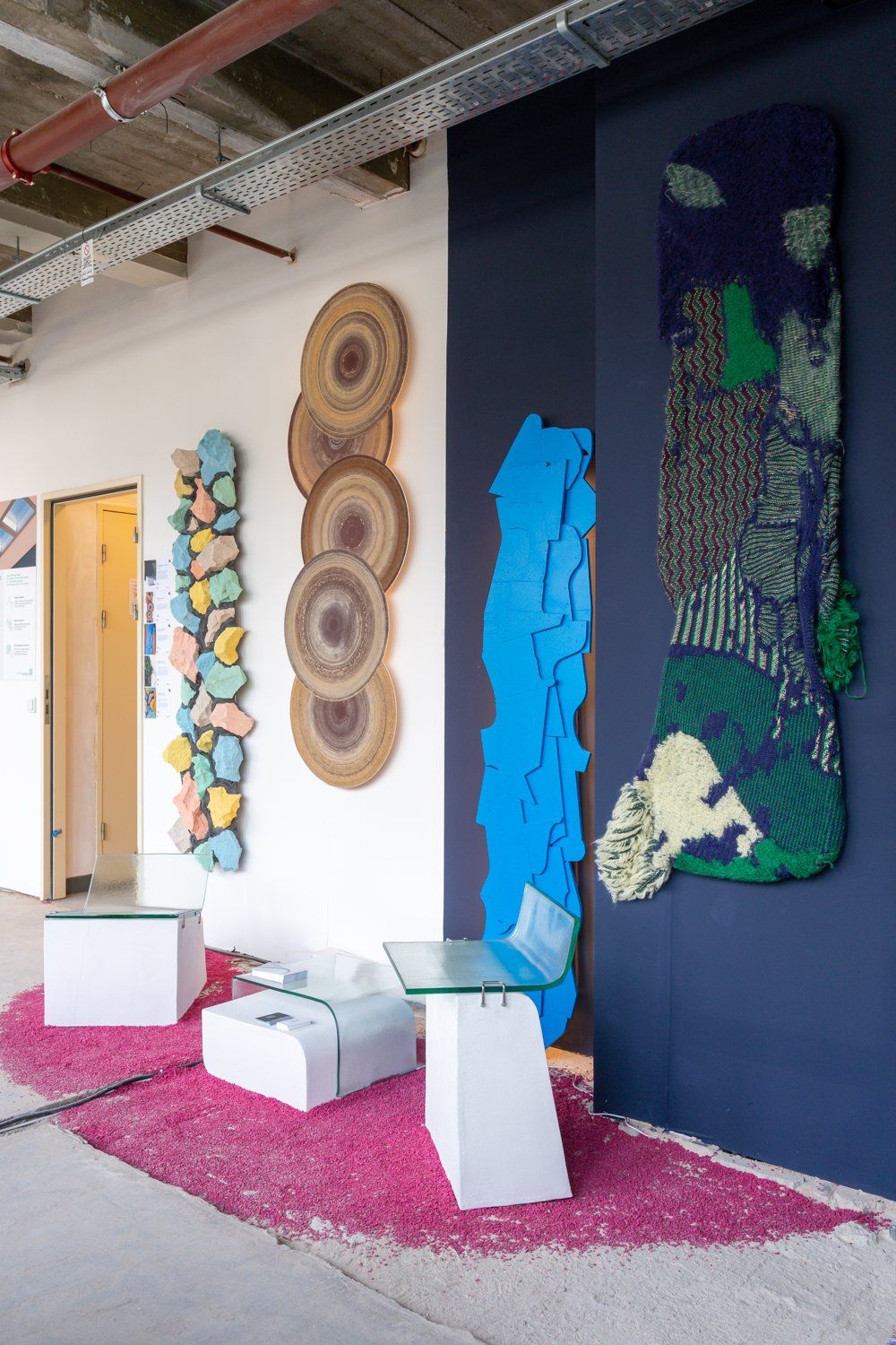
A nice little combination of wall objects by various designers at Messmerize. Time to move on!
Dutch Design Week 2022 – Designperron
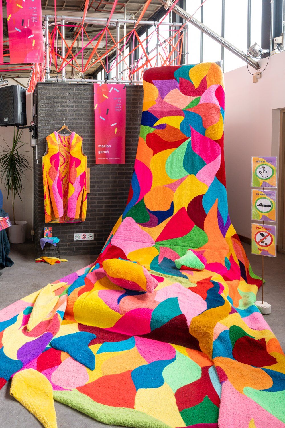
Final stop, Design Perron. If an algorithm could look in my head and then come up with my ideal design piece, then his maximalist work by Marian Genet would be it. Really, really looking forward to seeing her work again at the next edition of Big Art in Amsterdam!
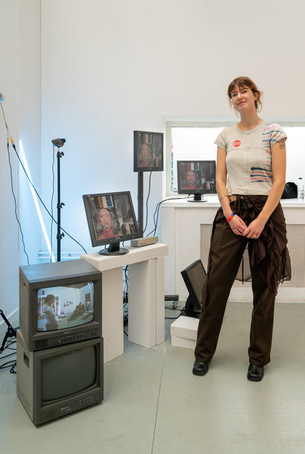
Long time, no see! One of my former students at Academie Artemis, Roos Minten, was showing her graduation project The Reality Show at Dutch Design Week – and that made me so proud! Good luck, Roos!
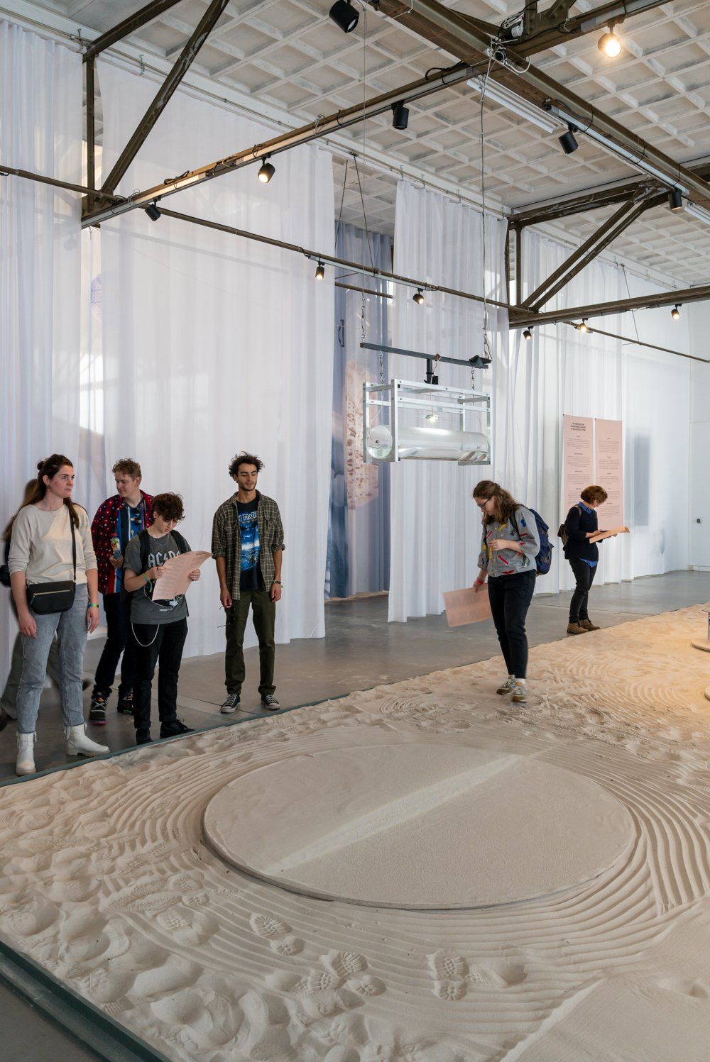
As I wrote on my Instagram Stories, this exhibition at Dutch Invertuals made my anal retentiveness play up HARD. It was basically a large sandbox with various design pieces that I’m sure would look fantastic if it was all raked to perfection like one of those Japanese gardens, but people. kept. walking. over. it.
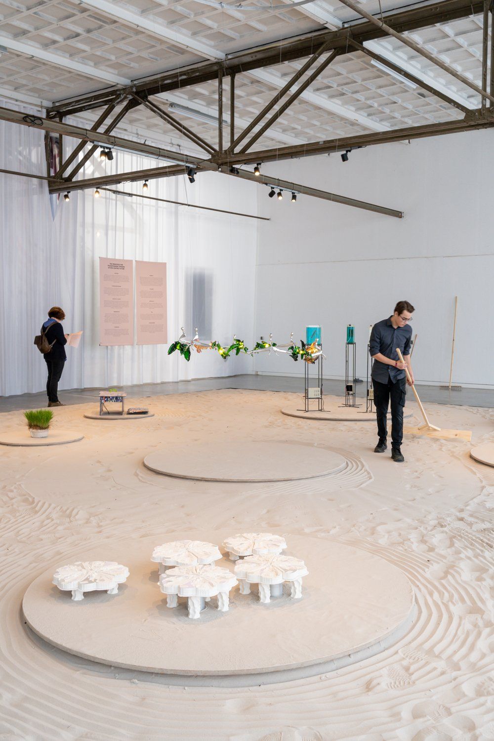
This guy was in charge of keeping all the circles in the sand nice and tidy – which was an impossible task, if you ask me.
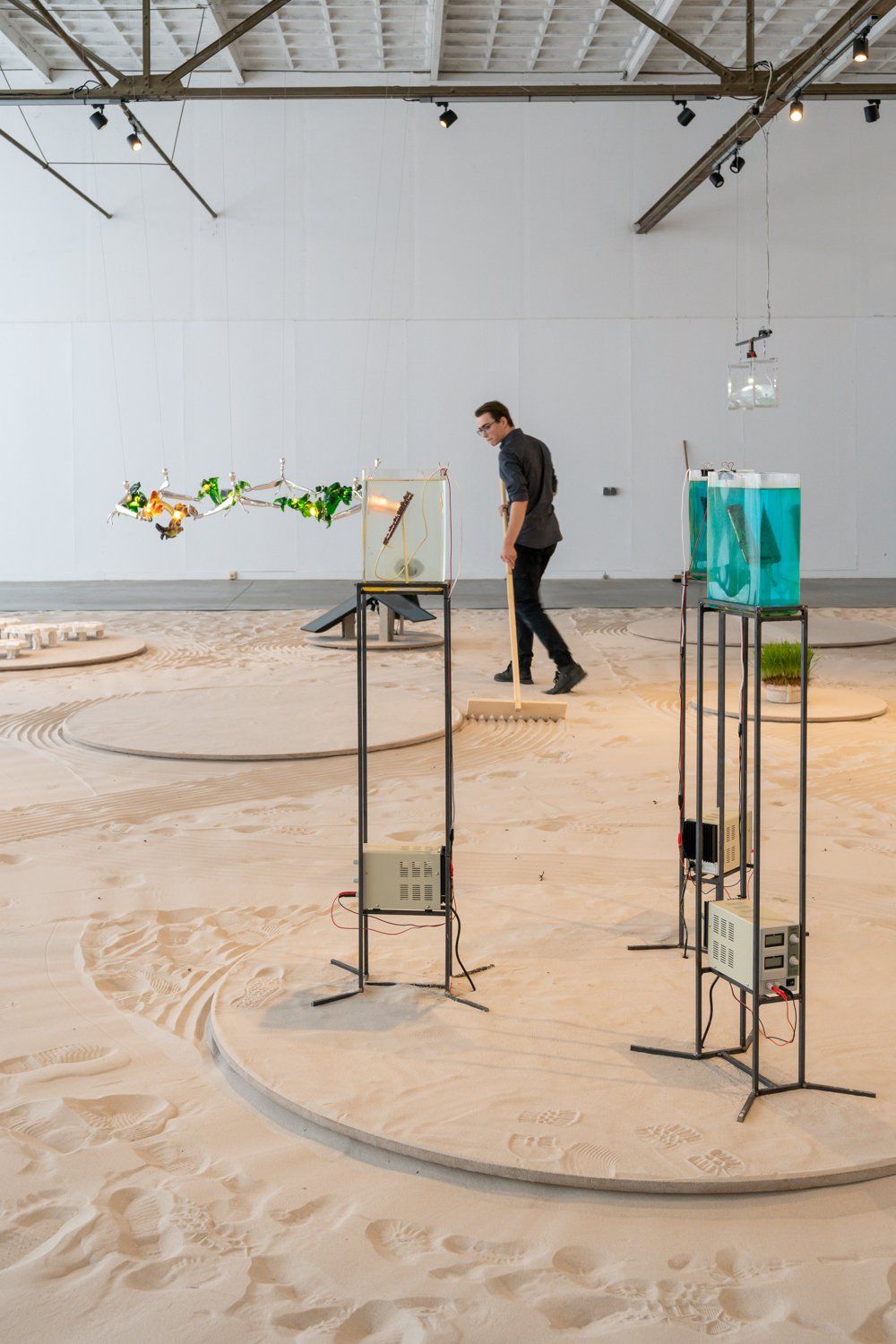
Lots of thought-provoking design on display in this exhibition called Exhibition Aequalis – and the rake guy, of course.
