Spice up your bedroom with the new Auping Pixel nightstand
It’s the first piece of furniture you see in the morning. And the last one before you send yourself off to sleep. Yup, I’m talking about the trusty old nightstand. I’ve looked many, many years for just the right solution. The ideal nightstand does not only look good, it also has…

It’s the first piece of furniture you see in the morning. And the last one before you send yourself off to sleep. Yup, I’m talking about the trusty old nightstand. I’ve looked many, many years for just the right solution. The ideal nightstand does not only look good, it also has to be functional and ideally feature a handy drawer for you to store the items in you need in bed. For me that would be the remote control, a wine cooler and an unlimited supply of chickpea chips – but I guess you can’t have everything. That being said, I have to admit that the new Auping Pixel nightstand is about as close to perfection as you can get. I have used it to spice up my bedroom and have to say I am duly impressed. Oh, and I interviewed its designer, Rudi van Erp.

Choices, choices! As you can see, you can customize the Auping Pixel nightstand to your heart’s content.
Spice up your bedroom with the new Auping Pixel nightstand
Hi Rudi! What’s so fun about designing a nightstand?
I love a good challenge! Here at Auping, we’ve been designing beds for 130 years now. Our design DNA is very recognizable. Auping beds are slender yet strong, that’s what we’re known for. I wanted to convey that DNA to the new Pixel nightstand as well. What made the design process even more challenging, is that the nightstand had to go not only with our own range of beds, but ideally with a bed from any other brand.
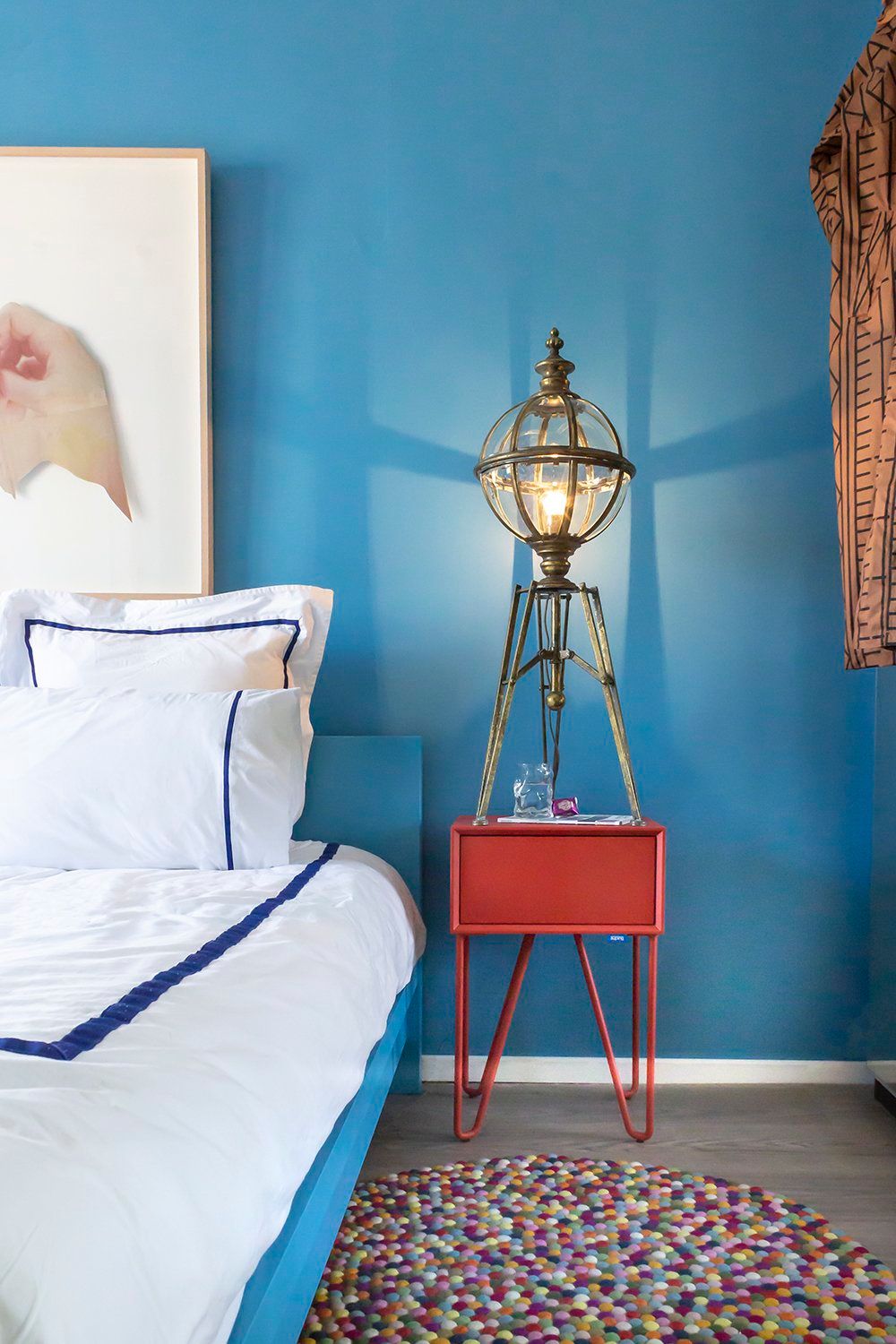
I love how the shape of the legs of the Auping Pixel Nightstand rhymes with the legs of the vintage English laboratory windlights I unearthed a while ago.
I don’t have an Auping bed myself (yet, I hasten to add) – but I have to say that the Pixel looks really cool next to it.
Thank you! Of course, color plays an important role in our story. Together with our brand stylists, we have done a lot of color trend research. Choosing colors for a range of bedroom products can be a daunting task, because they have to stay fashionable for at least ten years. Another challenge was to make the color range look good together. After all, you can choose different colors for the legs, the top and the drawer of the Pixel. That makes for thousands of combinations. Of course, you can also go for a monochrome version, like you did.
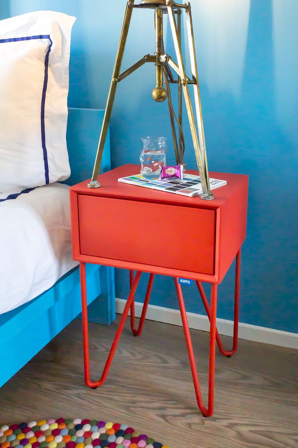

Check out faceted front of the Auping Pixel nightstand – designer Rudi van Erp really did pay attention to every detail, didn’t he?
I went for coral red because it’s such as nice contrast with my new Farrow & Ball St. Giles Blue walls. What about the design of the Pixel nightstand?
We make all of our own products here at our factory in the Netherlands. That also means that we can produce a prototype really quickly. That really makes the design process a lot easier. The Pixel is one of the first stand-alone nightstands I’ve designed for Auping, so it was definitely something new for me as well. Nightstands used to be a bit of an afterthought in design. And so, I’ve really tried to make the Pixel look appealing in its own right. Its legs have a rounded triangular shape, which is a reference to our Essential and Criade beds. The top, however, is sharp and rectangular. If you look carefully, you’ll see that the front is faceted. It’s a design choice that makes the transition to the drawer a lot subtler.
It’s so subtle I didn’t even notice there was a drawer there at first!
The push to open mechanism isn’t the cheapest design solution. It did, however, allow me to leave out a handle. It’s so much more refined this way. Did you also notice that both the legs and the cabinet have the same slightly rougher structure? It’s the kind of detail you don’t see until after you buy it. That kind of attention to detail is really important to us.
FOR MORE INFORMATION about the Auping Pixel nightstand, visit the excellent Auping website. And remember, it ain’t much if it isn’t Dutch!
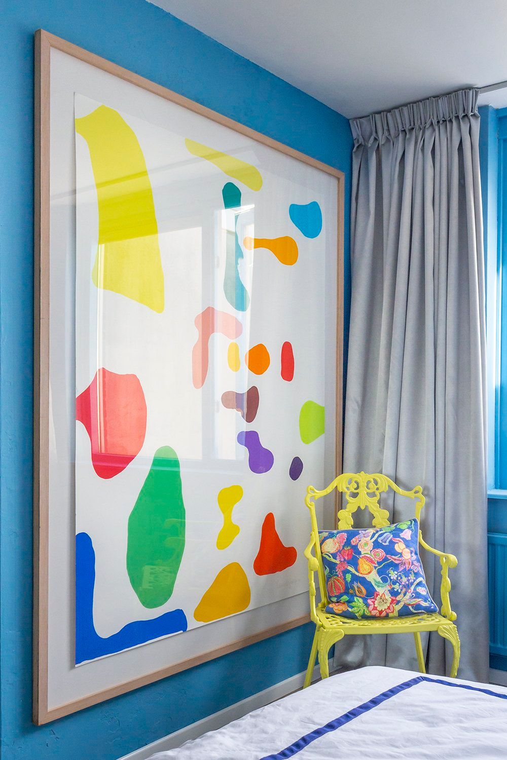

A little bonus photo for you – I got this work from artist Kees de Goede through my local art library, Kunstuitleen Rotterdam. Colorful, right?
